When discussing widgets like container and button, the term “Border Radius in Flutter” is used to describe the roundedness of the corners of these elements. The rounded corners of the widget can be adjusted by adjusting the border radius attribute.
If you modify a container’s border radius to 20, for instance, its corners will be rounded with a 20-pixel radius.
With Flutter BorderRadius class, you can configure the border radius property and adjust the radius of a widget border independently for each corner or globally.
Increasing the size of a border’s radius is a typical practice in mobile app design, with the goal of making UI elements look more polished and contemporary.
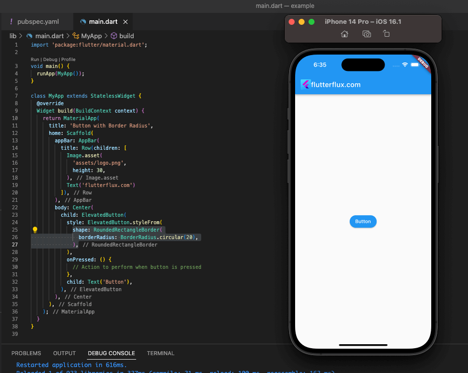
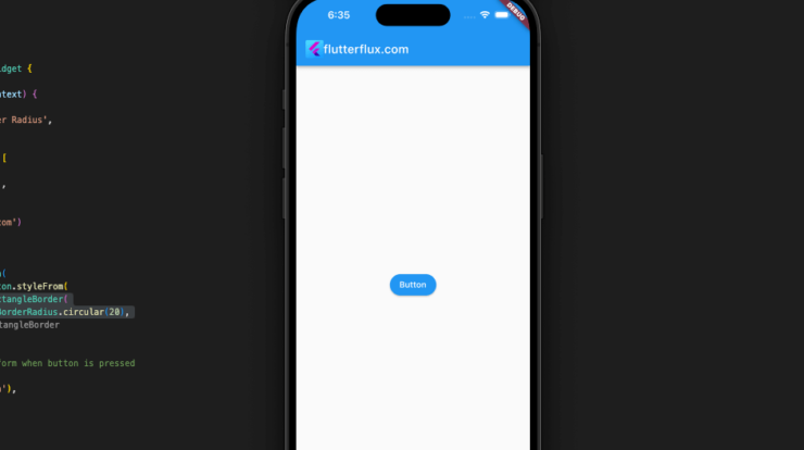
To create a button with border radius in Flutter, you can use the ElevatedButton widget and set its style property to ElevatedButton.styleFrom with the shape property set to RoundedRectangleBorder with a specified border radius.
example:
ElevatedButton(
  style: ElevatedButton.styleFrom(
    shape: RoundedRectangleBorder(
      borderRadius: BorderRadius.circular(20),
    ),
  ),
  onPressed: () {
    // Action to perform when button is pressed
  },
  child: Text('Button'),
),
“Button” is the label, and its border radius is 20. ElevatedButton style and child attributes allow you to change the button’s appearance, such as its color and text style.
Complete Code for Creating a Button with Border Radius in Flutter:
import 'package:flutter/material.dart';

void main() {
  runApp(MyApp());
}

class MyApp extends StatelessWidget {
  @override
  Widget build(BuildContext context) {
    return MaterialApp(
      title: 'Button with Border Radius',
      home: Scaffold(
        appBar: AppBar(
          title: Text('Button with Border Radius'),
        ),
        body: Center(
          child: ElevatedButton(
            style: ElevatedButton.styleFrom(
              shape: RoundedRectangleBorder(
                borderRadius: BorderRadius.circular(20),
              ),
            ),
            onPressed: () {
              // Action to perform when button is pressed
            },
            child: Text('Button'),
          ),
        ),
      ),
    );
  }
}
Customize Border Radius ElevatedButton in Flutter
Flutter shape parameter lets you adjust an ElevatedButton Border Radius in Flutter. changes styleFrom into a rounded rectangle with the border radius. Here’s a case in point:
ElevatedButton(
  style: ElevatedButton.styleFrom(
    shape: RoundedRectangleBorder(
      borderRadius: BorderRadius.only(
        topLeft: Radius.circular(20),
        topRight: Radius.circular(10),
        bottomLeft: Radius.circular(30),
        bottomRight: Radius.circular(5),
      ),
    ),
   // Other button styles such as color and padding
  ),
  onPressed: () {
   // Action to perform when button is pressed
  },
  child: Text('Button'),
),
This example created an ElevatedButton with the style ElevatedButton. styleFrom with RoundedRectangleBorder and button corner radius values. TopLeft is 20 pixels, topRight is 10 pixels, bottomLeft is 30 pixels, and bottomRight is 5 pixels. We created a onPressed function and set the ElevatedButton’s child property to a Text widget labeled “Button.” read too How to Add Image in Circleavatar in Flutter

