Flutter Cupertino Date Picker mimics iOS’s date picker. Like iOS, it uses Cupertino design. You must include the cupertino package in your Flutter project before you can utilize the Cupertino Date Picker.
import 'package:flutter/cupertino.dart';
After that, you can show the date selector by employing the CupertinoDatePicker widget:
CupertinoDatePicker(
  mode: CupertinoDatePickerMode.date,
  onDateTimeChanged: (DateTime newDateTime) {
    // Handle the selected date
  },
)
The mode property defines whether the picker shows the date, time, or both (CupertinoDatePickerMode.dateAndTime).
When the user changes the date or time, onDateTimeChanged is called. This callback lets you set your app’s date and time. The date picker backgroundColor, minimumDate, maximumDate, minuteInterval, and more can be customized.
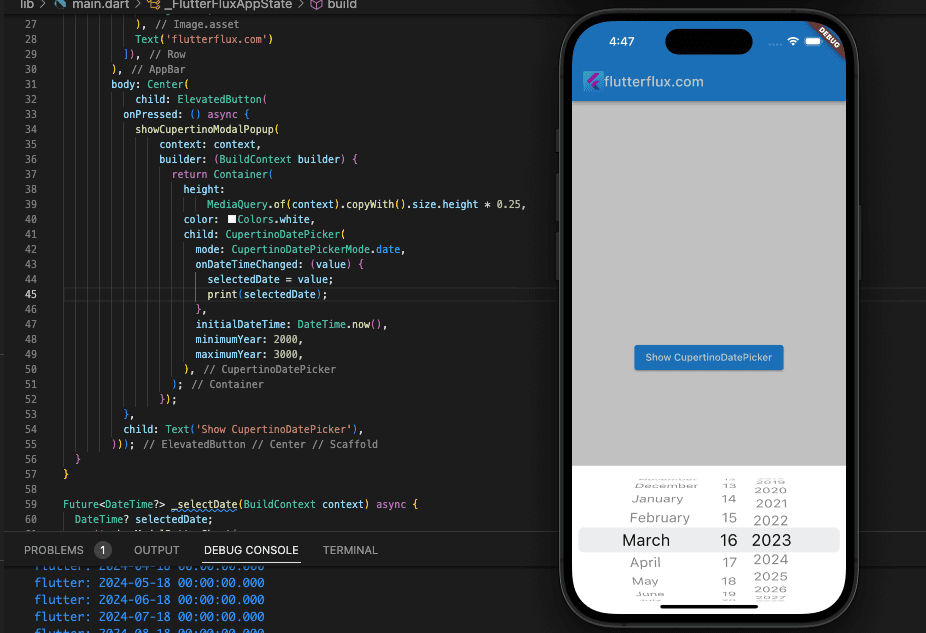
Basic Cupertino Date Picker implementation:
import 'package:flutter/cupertino.dart';
import 'package:flutter/cupertino.dart';
import 'package:flutter/material.dart';

void main() {
  runApp(MaterialApp(
    home: FlutterFluxApp(),
  ));
}

class FlutterFluxApp extends StatefulWidget {
  const FlutterFluxApp({super.key});

  @override
  State createState() => _FlutterFluxAppState();
}

class _FlutterFluxAppState extends State {
  DateTime? selectedDate;
  @override
  Widget build(BuildContext context) {
    return Scaffold(
        appBar: AppBar(
          title: Row(children: [
            Image.asset(
              'assets/logo.png',
              height: 30,
            ),
            Text('flutterflux.com')
          ]),
        ),
        body: Center(
            child: ElevatedButton(
          onPressed: () async {
            showCupertinoModalPopup(
                context: context,
                builder: (BuildContext builder) {
                  return Container(
                    height:
                        MediaQuery.of(context).copyWith().size.height * 0.25,
                    color: Colors.white,
                    child: CupertinoDatePicker(
                      mode: CupertinoDatePickerMode.date,
                      onDateTimeChanged: (value) {
                        selectedDate = value;
                        print(selectedDate);
                      },
                      initialDateTime: DateTime.now(),
                      minimumYear: 2000,
                      maximumYear: 3000,
                    ),
                  );
                });
          },
          child: Text('Show CupertinoDatePicker'),
        )));
  }
}
The implemented date picker only provides options for the years 2021 through 2023. In order to keep track of the date the user has chosen, we utilize a variable called _selectedDate.
Cupertino Date Picker in ModalBottomSheet
The Flutter CupertinoDatePicker widget is shown as a full-screen modal popup by default. Wrapping the CupertinoDatePicker in a showModalBottomSheet function generates the bottom sheet and returns a Future that resolves to the value picked in the picker. Here’s a case in point:
import 'package:flutter/cupertino.dart';
import 'package:flutter/material.dart';

void main() {
  runApp(MaterialApp(
    home: FlutterFluxApp(),
  ));
}

class FlutterFluxApp extends StatefulWidget {
  const FlutterFluxApp({super.key});

  @override
  State createState() => _FlutterFluxAppState();
}

class _FlutterFluxAppState extends State {
  @override
  Widget build(BuildContext context) {
    return Scaffold(
        appBar: AppBar(
          title: Row(children: [
            Image.asset(
              'assets/logo.png',
              height: 30,
            ),
            Text('flutterflux.com')
          ]),
        ),
        body: Center(
            child: ElevatedButton(
          onPressed: () async {
            await _selectDate(context);
          },
          child: Text('Show CupertinoDatePicker'),
        )));
  }
}

Future<DateTime?> _selectDate(BuildContext context) async {
  DateTime? selectedDate;
  await showModalBottomSheet(
    context: context,
    builder: (BuildContext context) {
      return Container(
        height: 300,
        child: CupertinoDatePicker(
          mode: CupertinoDatePickerMode.date,
          onDateTimeChanged: (DateTime newDateTime) {
            selectedDate = newDateTime;
            print(selectedDate);
          },
        ),
      );
    },
  );
  return selectedDate;
}
With this method, you may generate a Container with a 300-pixel height that holds a CupertinoDatePicker with the date mode. A user-selected date is reflected in the selectedDate variable via the onDateTimeChanged callback method.
With the showModalBottomSheet method, a modal bottom sheet may be generated that holds the date picker Container.
Several different date picker constructors are available in the Flutter CupertinoDatePicker widget. Some typical Cupertino Date Picker constructors are as follows:
CupertinoDatePickerconstructor:
CupertinoDatePicker({
  Key? key,
  required this.onDateTimeChanged,
  this.mode = CupertinoDatePickerMode.dateAndTime,
  this.initialDateTime,
  this.minimumDate,
  this.maximumDate,
  this.minimumYear = 1,
  this.maximumYear = 9999,
  this.minuteInterval = 1,
  this.use24hFormat = false,
  this.backgroundColor,
  this.textStyle,
  this.diameterRatio = 1.07,
  this.scrollController,
})
CupertinoDatePicker fundamental builder looks like this. It requires a callback method, onDateTimeChanged, to be set, and invokes it anytime the user modifies the date or time. The mode attribute of the picker specifies whether the date and time are shown together, separately, or only the date (CupertinoDatePickerMode.date), or neither (CupertinoDatePickerMode.time) (CupertinoDatePickerMode.dateAndTime). The initialDateTime attribute controls the time and date that appear in the picker by default. The range of available dates is limited by the minimumDate and maximumDate attributes. The minimumYear and maximumYear attributes limit the range of available years. Setting the space between the minutes in the time picker is done with the minuteInterval attribute. Setting the time picker to a 12-hour or 24-hour format is done using the use24hFormat attribute. You may change the look of the date picker by adjusting the backgroundColor and textStyle parameters.
CupertinoDatePicker.dateconstructor:
CupertinoDatePicker.date({
  Key? key,
  required this.onDateChanged,
  this.initialDate,
  this.minimumDate,
  this.maximumDate,
  this.minimumYear = 1,
  this.maximumYear = 9999,
  this.backgroundColor,
  this.textStyle,
  this.mode = CupertinoDatePickerMode.date,
  this.maximumYearDifference,
})
A date selector is what this builder generates. When the user changes the date, it triggers the onDateChanged callback. The initialDate attribute controls the default date shown in the selector. The range of available dates is limited by the minimumDate and maximumDate attributes. The minimumYear and maximumYear attributes limit the range of available years. You may change the look of the date picker by adjusting the backgroundColor and textStyle parameters.
CupertinoDatePicker.timeconstructor:
CupertinoDatePicker.time({
  Key? key,
  required this.onDateTimeChanged,
  this.initialDateTime,
  this.minuteInterval = 1,
  this.use24hFormat = false,
  this.backgroundColor,
  this.textStyle,
  this.mode = CupertinoDatePickerMode.time,
  this.maximumYearDifference,
})
A time-only selector is what this builder produces. When the user changes the time, the onDateTimeChanged callback is triggered. Initially, the picker will show the time specified by the initialDateTime attribute. Set the space between minutes in the time picker by using the minuteInterval attribute. When setting up a time picker, you can choose between a 24-hour and 12-hour format by using the use24hFormat attribute. It is possible to alter the time picker visual style with the help of the backgroundColor and textStyle attributes.
Conclusion
The Flutter Cupertino Date Picker widget makes it possible to pick a date or time with an interface like to that found on iOS devices. It comes as part of Apple’s “Cupertino” bundle and mimics the iOS operating system’s aesthetic.
The Cupertino Date Picker widget makes it easy for users of your Flutter app to choose a date and time. The widget’s mode, minimumDate, maximumDate, use24hFormat, and other parameters allow for extensive personalization of the widget’s functionality and appearance.


