Dark and Light Mode in flutter use various color palettes for user interfaces. Dark mode uses black or dark gray backgrounds and text, whereas light mode uses white or light gray.
Personal preference, lighting, and time of day might affect mode selection. In low-light or nighttime circumstances, dark mode may lessen eye strain, while light mode may be more comfortable to read.
Several apps and operating systems now offer both dark and light modes, letting users pick the one they like best. Flutter developers may easily implement dark and light mode themes for consumers.
To implement Dark and Light Mode in flutter, follow these steps:
- Create a new Flutter project or open an existing one.
- Create a new folder named “themes” in your project directory.
- Light_theme.dart and dark_theme.dart should be created in the “themes” folder.
- In each file, create a new class and extend the “ThemeData” class.
- Specify theme attributes like primary color, accent color, text theme, etc.
- In the “main.dart” file, import both theme classes and create a new boolean variable named “isDarkMode” to represent the current theme mode.
- Wrap your entire app widget tree with a “MaterialApp” widget and set the “theme” property to the “light_theme.dart” class.
- Create a new “Theme” widget inside your app widget tree and set its “data” property to the “dark_theme.dart” class.
- Use a “ValueListenableBuilder” widget to listen to changes in the “isDarkMode” variable and update the theme accordingly.
- Finally, create a button or switch widget to toggle between the two themes and update the “isDarkMode” variable accordingly.
Example code snippet:
import 'package:flutter/material.dart';
import 'package:my_app/themes/dark_theme.dart';
import 'package:my_app/themes/light_theme.dart';

void main() {
  runApp(MyApp());
}

class MyApp extends StatefulWidget {
  @override
  _MyAppState createState() => _MyAppState();
}

class _MyAppState extends State<MyApp> {
  bool isDarkMode = false;

  @override
  Widget build(BuildContext context) {
    return MaterialApp(
      title: 'Flutter Dark Mode Demo',
      theme: isDarkMode ? darkThemeData : lightThemeData,
      home: ValueListenableBuilder(
        valueListenable: ValueNotifier(isDarkMode),
        builder: (context, value, child) {
          return Scaffold(
            appBar: AppBar(
              title: Text('Flutter Dark Mode Demo'),
            ),
            body: Center(
              child: Text(
                'Hello, World!',
                style: Theme.of(context).textTheme.headline4,
              ),
            ),
            floatingActionButton: FloatingActionButton(
              onPressed: () {
                setState(() {
                  isDarkMode = !isDarkMode;
                });
              },
              child: Icon(Icons.brightness_6),
            ),
          );
        },
      ),
    );
  }
}
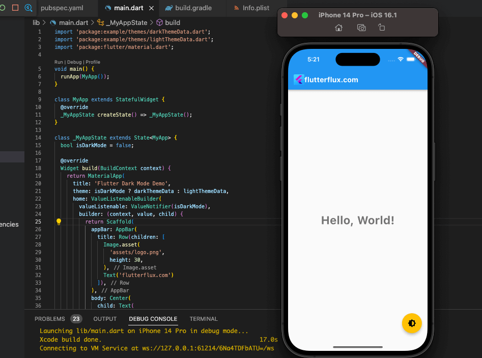
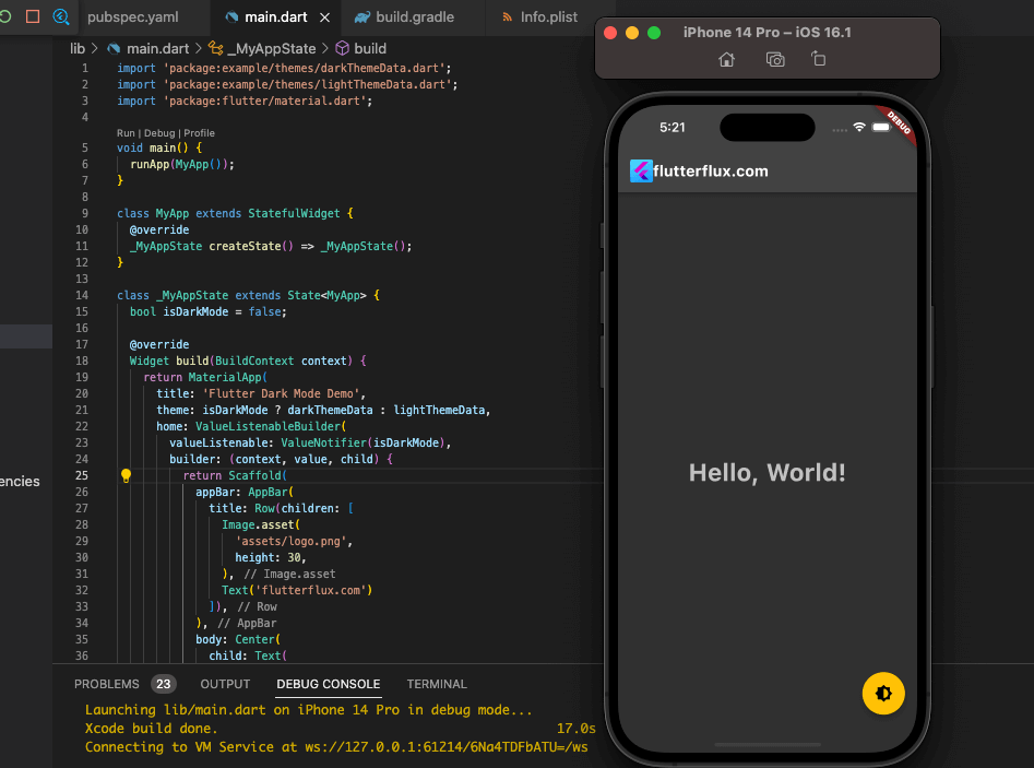
In this example, we have created two theme classes named “lightThemeData” and “darkThemeData”. Finally, we have created a floating action button to toggle between the two themes and update the “isDarkMode” variable accordingly.
lightThemeData
lightThemeData is a custom theme data class for implementing a light mode theme in a Flutter app. It can be defined as follows:
import 'package:flutter/material.dart';

final ThemeData lightThemeData = ThemeData(
  brightness: Brightness.light,
  primarySwatch: Colors.blue,
  accentColor: Colors.amber,
  fontFamily: 'Roboto',
  textTheme: TextTheme(
    headline1:  Style(fos-number">72.0,,
   fontSize: 56.0, ,
    headline3:TextStyle(fontSimber">44.0, ,
    headline4:TextStyle(fontSimber">32.0, ,
    headline5:TextStyle(fontSimber">24.0, ,
    headline6:TextStyle(fontSimber">20.0, ,
    bodyText1:TextStyle(fontSimber">16.0),
    TextStyle(14.0),
    fontSize: 18.0),
   subtitle2:fontSize: 16.0),
  )
is example, we have defined a ThemeData following properties:
brightness: set to to indicate that this is a light mode themerySwatch: a color swatch used to generate various shades othis case, we are using the blue color swatch.accentColor: the accent color used for buttons, sliders, and other interactive elements. In this case, we are using the amber color.fontFamily: the default font family used for text in the app. In this case, we are using the Roboto font family.textTheme: a collection of text styles used for various text widgets in the app. We have defined different font sizes for different types of headlines, body text, and subtitles.
Customize these properties for your app’s look.
darkThemeData
darkThemeData is a custom theme data class for implementing a dark mode theme in a Flutter app. It can be defined as follows:
import 'package:flutter/material.dart';

final ThemeData darkThemeData = ThemeData(
  brightness: Brightness.dark,
  primarySwatch: Colors.blueGrey,
  accentColor: Colors.amber,
  fontFamily: 'Roboto',
  textTheme: TextTheme(
    headline1: titextStyle(72.0,
    headline3:TextStyle(fontSimber">44.0, ,
    headline4:TextStyle(fontSimber">32.0, ,
    headline5:TextStyle(fontSimber">24.0, ,
    headline6:TextStyle(fontSimber">20.0, ,
    bodyText1:TextStyle(fontSimber">16.0),
    TextStyle(14.0),
    fontSize: 18.0),
brightness: set to to indicate that this is a dark mode theme.<Swatch>: a color swatch used to generate various shades of is case, we are using the blue-grey color swatch.accentColor: the accent color used for buttons, sliders, and other interactive elements. In this case, we are using the amber color.fontFamily: the default font family used for text in the app. In this case, we are using the Roboto font family.textTheme: a collection of text styles used for various text widgets in the app. We have defined different font sizes for different types of headlines, body text, and subtitles.
You can customize these properties to suit your app’s design requirements.
Conclusion
Dark and Light Mode in flutter. Developers can easily implement this feature by specifying the color scheme for each mode and switching between them based on user desire or system settings. Dark Mode makes the app easier to see in low light. Light Mode, the default mode, gives the app a more recognizable look. read too AlertDialog Flutter Example

