Multiple Floating Action Button in Flutter – FloatingActionButton in Flutter (FAB) is a typical UI component intended to facilitate easy access to an app most important and often performed tasks. A floating circular button with an icon or text is the most common form in which this feature is presented.
The FloatingActionButton widget is used to make an FAB in Flutter. The backgroundColor, foregroundColor, elevation, shape, and onPressed callback function are just some of the properties you may use to give it a unique look.
Basic Floating Action Button in Flutter
floatingActionButton: FloatingActionButton(
  onPressed: () {
    // Perform some action when the button is pressed
  },
  child: Icon(Icons.add),
),
The onPressed callback function is associated with the FloatingActionButton widget and is invoked when the button is pressed. The button’s displayed icon can be set with the child property.
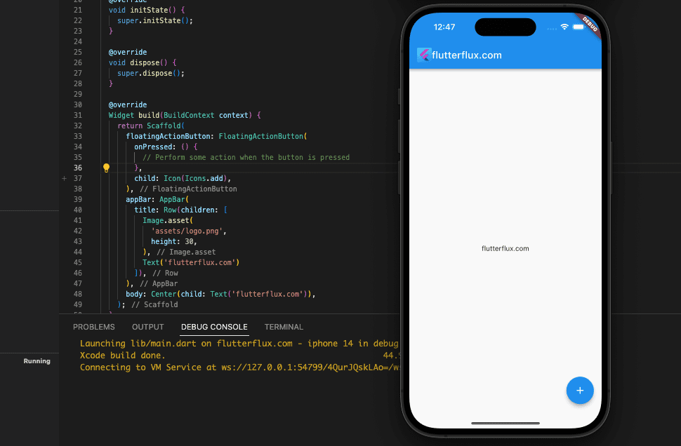
The Scaffold widget, which controls the layout of the screen, needs to be updated by adding the floatingActionButton attribute. The FAB appears in the bottom right corner of the display by default, however this can be changed with the floatingActionButtonLocation parameter.
Flutter Multiple FloatingActionButton
Using Flutter, you may customize your app’s interface with several floatingactionbutton. An excerpt of code that generates two FloatingActionButtons in Flutter is as follows:
floatingActionButton: Column(
  mainAxisAlignment: MainAxisAlignment.end,
  children: [
    FloatingActionButton(
      onPressed: () {
        // Perform some action when the first button is pressed
      },
      child: Icon(Icons.add),
    ),
    SizedBox(height: 16),
    FloatingActionButton(
      onPressed: () {
        // Perform some action when the second button is pressed
      },
      child: Icon(Icons.delete),
    ),
  ],
),
The floatingActionButton property is assigned to a Column widget which, in turn, is assigned two FloatingActionButton widget. The floatingActionButton is aligned with the bottom of the screen by setting the mainAxisAlignment property to MainAxisAlignment.end.
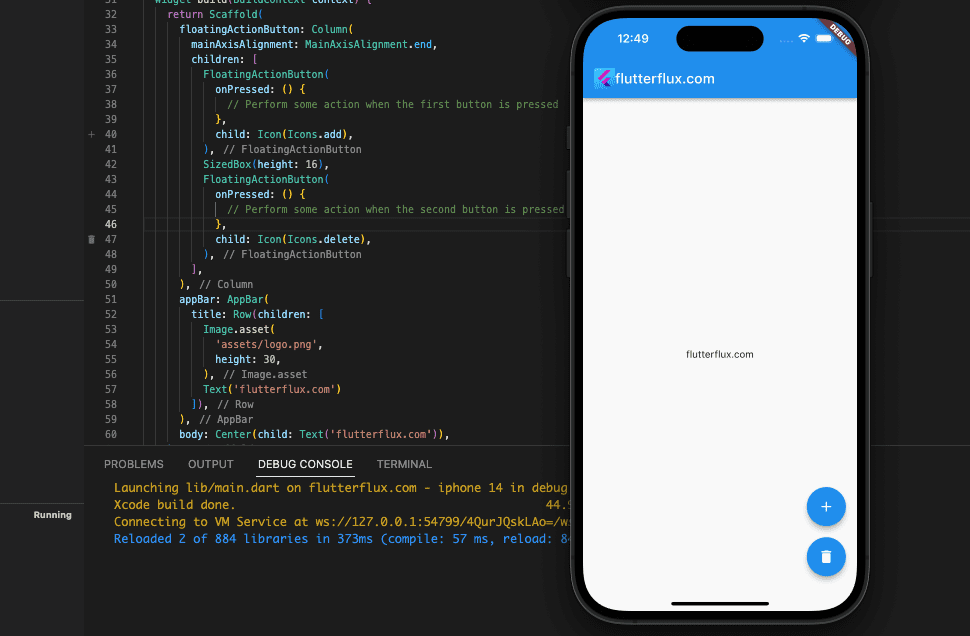
A 16-pixel-tall SizedBox widget is utilized to create visual separation between the two floatingActionButton. The distance between them can be modified as required.
When using more than one floatingActionButton, be sure that they all serve separate purposes and don’t conflict with one another.
Multiple FloatingActionButton with Animation
Using the AnimatedContainer and Transform widgets, multiple floatingActionButton(FAB) with on-tap animation may be created in Flutter. Here’s a code snippet that shows how to make several floatingActionButton that can all be animated:
import 'package:flutter/material.dart';

void main() {
  runApp(MyApp());
}

class MyApp extends StatelessWidget {
  @override
  Widget build(BuildContext context) {
    return MaterialApp(title: 'flutterflux', home: MyHomePage());
  }
}

class MyHomePage extends StatefulWidget {
  @override
  _MyHomePageState createState() => _MyHomePageState();
}

class _MyHomePageState extends State
    with SingleTickerProviderStateMixin {
  bool isOpened = false;
  late AnimationController _animationController;
  late Animation<Color?> _buttonColor;
  Animation? _animateIcon;
  Animation? _translateButton;
  Curve _curve = Curves.easeOut;
  double _fabHeight = 56.0;

  @override
  initState() {
    _animationController =
        AnimationController(vsync: this, duration: Duration(milliseconds: 500))
          ..addListener(() {
            setState(() {});
          });
    _animateIcon =
        Tween(begin: 0.0, end: 1.0).animate(_animationController);
    _buttonColor = ColorTween(
      begin: Colors.blue,
      end: Colors.red,
    ).animate(CurvedAnimation(
      parent: _animationController,
      curve: Interval(
        0.00,
        1.00,
        curve: Curves.linear,
      ),
    ));
    _translateButton = Tween(
      begin: _fabHeight,
      end: -14.0,
    ).animate(CurvedAnimation(
      parent: _animationController,
      curve: Interval(
        0.0,
        0.75,
        curve: _curve,
      ),
    ));
    super.initState();
  }

  @override
  dispose() {
    _animationController.dispose();
    super.dispose();
  }

  animate() {
    if (!isOpened) {
      _animationController.forward();
    } else {
      _animationController.reverse();
    }
    isOpened = !isOpened;
  }

  Widget add() {
    return Container(
      child: FloatingActionButton(
        onPressed: () {},
        tooltip: 'Add',
        child: Icon(Icons.add),
      ),
    );
  }

  Widget image() {
    return Container(
      child: FloatingActionButton(
        onPressed: () {},
        tooltip: 'Image',
        child: Icon(Icons.image),
      ),
    );
  }

  Widget inbox() {
    return Container(
      child: FloatingActionButton(
        onPressed: () {},
        tooltip: 'Inbox',
        child: Icon(Icons.inbox),
      ),
    );
  }

  Widget toggle() {
    return Container(
      child: FloatingActionButton(
        backgroundColor: _buttonColor.value,
        onPressed: animate,
        tooltip: 'Toggle',
        child: AnimatedIcon(
          icon: AnimatedIcons.menu_close,
          progress: _animateIcon!,
        ),
      ),
    );
  }

  @override
  Widget build(BuildContext context) {
    return Scaffold(
      appBar: AppBar(
        title: Row(children: [
          Image.asset(
            'assets/logo.png',
            height: 30,
          ),
          Text('flutterflux.com')
        ]),
      ),
      body: Center(
        child: Text("Press the button to see the animation"),
      ),
      floatingActionButton: Column(
        mainAxisAlignment: MainAxisAlignment.end,
        children: [
          Transform(
            transform: Matrix4.translationValues(
                0.0, _translateButton!.value * 2.0, 0.0),
            child: add(),
          ),
          Transform(
            transform:
                Matrix4.translationValues(0.0, _translateButton!.value, 0.0),
            child: image(),
          ),
          toggle(),
        ],
      ),
    );
  }
}

Here, clicking the toggle button activates the animation method.
Draggable FloatingActionButton in Flutter
Wrapping a FloatingActionButton with Flutter Draggable widget makes it possible to drag it across the screen. A sample of full code would look like this:
import 'dart:math';

import 'package:flutter/material.dart';

void main() {
  runApp(MyApp());
}

class MyApp extends StatelessWidget {
  @override
  Widget build(BuildContext context) {
    return MaterialApp(title: 'flutterflux', home: MyHomePage());
  }
}

class MyHomePage extends StatefulWidget {
  @override
  _MyHomePageState createState() => _MyHomePageState();
}

class _MyHomePageState extends State {
  @override
  dispose() {
    super.dispose();
  }

  @override
  Widget build(BuildContext context) {
    return Scaffold(
        appBar: AppBar(
          title: Row(children: [
            Image.asset(
              'assets/logo.png',
              height: 30,
            ),
            Text('flutterflux.com')
          ]),
        ),
        body: Center(
          child: Text("Press the button to see the animation"),
        ),
        floatingActionButton: DraggableFab(
          initPosition: Offset.fromDirection(20, 400),
          child: FloatingActionButton(
            mini: false,
            tooltip: 'flutterflux',
            onPressed: () {},
            child: Image.asset(
              "assets/logo.png",
            ),
          ),
        ));
  }
}

/// Draggable FAB widget which is always aligned to
/// the edge of the screen - be it left,top, right,bottom
class DraggableFab extends StatefulWidget {
  final Widget child;
  final Offset? initPosition;
  final double securityBottom;

  const DraggableFab(
      {Key? key,
      required this.child,
      this.initPosition,
      this.securityBottom: 0})
      : super(key: key);

  @override
  _DraggableFabState createState() => _DraggableFabState();
}

class _DraggableFabState extends State {
  late Size _widgetSize;
  double? _left, _top;
  double _screenWidth = 0.0, _screenHeight = 0.0;
  double? _screenWidthMid, _screenHeightMid;

  @override
  void initState() {
    super.initState();
    WidgetsBinding.instance
        .addPostFrameCallback((_) => _getWidgetSize(context));
  }

  void _getWidgetSize(BuildContext context) {
    _widgetSize = context.size!;

    if (widget.initPosition != null) {
      _calculatePosition(widget.initPosition!);
    }
  }

  @override
  Widget build(BuildContext context) {
    return Stack(children: [
      Positioned(
        left: this._left,
        top: this._top,
        child: Draggable(
          child: widget.child,
          feedback: widget.child,
          onDragEnd: _handleDragEnded,
          childWhenDragging: Container(
            width: 0.0,
            height: 0.0,
          ),
        ),
      )
    ]);
  }

  void _handleDragEnded(DraggableDetails draggableDetails) {
    this._calculatePosition(draggableDetails.offset);
  }

  void _calculatePosition(Offset targetOffset) {
    if (_screenWidthMid == null || _screenHeightMid == null) {
      Size screenSize = MediaQuery.of(context).size;
      _screenWidth = screenSize.width;
      _screenHeight = screenSize.height;
      _screenWidthMid = _screenWidth / 2;
      _screenHeightMid = _screenHeight / 2;
    }

    switch (_getAnchor(targetOffset)) {
      case Anchor.LEFT_FIRST:
        this._left = _widgetSize.width / 2;
        this._top = max(_widgetSize.height / 2, targetOffset.dy);
        break;
      case Anchor.TOP_FIRST:
        this._left = max(_widgetSize.width / 2, targetOffset.dx);
        this._top = _widgetSize.height / 2;
        break;
      case Anchor.RIGHT_SECOND:
        this._left = _screenWidth - _widgetSize.width;
        this._top = max(_widgetSize.height, targetOffset.dy);
        break;
      case Anchor.TOP_SECOND:
        this._left = min(_screenWidth - _widgetSize.width, targetOffset.dx);
        this._top = _widgetSize.height / 2;
        break;
      case Anchor.LEFT_THIRD:
        this._left = _widgetSize.width / 2;
        this._top = min(
            _screenHeight - _widgetSize.height - widget.securityBottom,
            targetOffset.dy);
        break;
      case Anchor.BOTTOM_THIRD:
        this._left = _widgetSize.width / 2;
        this._top = _screenHeight - _widgetSize.height - widget.securityBottom;
        break;
      case Anchor.RIGHT_FOURTH:
        this._left = _screenWidth - _widgetSize.width;
        this._top = min(
            _screenHeight - _widgetSize.height - widget.securityBottom,
            targetOffset.dy);
        break;
      case Anchor.BOTTOM_FOURTH:
        this._left = _screenWidth - _widgetSize.width;
        this._top = _screenHeight - _widgetSize.height - widget.securityBottom;
        break;
    }
    setState(() {});
  }

  /// Computes the appropriate anchor screen edge for the widget
  Anchor _getAnchor(Offset position) {
    if (position.dx < _screenWidthMid! && position.dy < _screenHeightMid!) {
      return position.dx < position.dy ? Anchor.LEFT_FIRST : Anchor.TOP_FIRST; } else if (position.dx >= _screenWidthMid! &&
        position.dy < _screenHeightMid!) {
      return _screenWidth - position.dx < position.dy
          ? Anchor.RIGHT_SECOND
          : Anchor.TOP_SECOND;
    } else if (position.dx < _screenWidthMid! && position.dy >= _screenHeightMid!) {
      return position.dx < _screenHeight - position.dy
          ? Anchor.LEFT_THIRD
          : Anchor.BOTTOM_THIRD;
    } else {
      return _screenWidth - position.dx < _screenHeight - position.dy
          ? Anchor.RIGHT_FOURTH
          : Anchor.BOTTOM_FOURTH;
    }
  }
}

/// #######################################
/// #       |          #        |         #
/// #    TOP_FIRST     #  TOP_SECOND      #
/// # - LEFT_FIRST     #  RIGHT_SECOND -  #
/// #######################################
/// # - LEFT_THIRD     #   RIGHT_FOURTH - #
/// #  BOTTOM_THIRD    #   BOTTOM_FOURTH  #
/// #     |            #       |          #
/// #######################################
enum Anchor {
  LEFT_FIRST,
  TOP_FIRST,
  RIGHT_SECOND,
  TOP_SECOND,
  LEFT_THIRD,
  BOTTOM_THIRD,
  RIGHT_FOURTH,
  BOTTOM_FOURTH
}
DraggableFab is a user-defined widget defined by this code; FloatingActionButton that can be moved around the screen. The widget parameters include the child widget to be utilized as the floatingActionButton, the floatingActionButton starting position, and a security bottom value (which is used to ensure that the FloatingActionButton does not go below a certain point on the screen).

This widget strategically places the FloatingActionButton on the screen using a Stack and a Positioned widget. The user can reposition the FloatingActionButton anywhere on the screen by dragging it with the help of a Draggable widget. When the user lets go of the FloatingActionButton, the _handleDragEnded function is triggered, at which point the FloatingActionButton new position is determined based on the point of release.
It is the job of the _calculatePosition function to figure out where on the screen the FAB should be anchored. The _getAnchor function is used to pick one of the nine available anchors for the FAB. After identifying the anchor point, the _calculatePosition function modifies the left and top values of the FloatingActionButton position before invoking setState to refresh the screen.
There are nine distinct places where the FloatingActionButton can be anchored, and they are all specified by the Anchor enum. The screen’s anchor points are laid out in a 3×3 grid, with the LEFT FIRST anchor located in the upper left corner and the BOTTOM FOURTH anchor located in the lower right corner.
Conclusion
Flutter FloatingActionButton (FAB) is a handy widget that makes it simple to implement a floating action button in an app. The FloatingActionButton can be modified to take on a variety of forms, sizes, colors, and icons to complement the aesthetic of the app. It typically initiates a critical app operation, such creating a new item or accessing a crucial function. The FloatingActionButton may also be simply combined with other app widgets and features built-in animation.

