Types of Button in Flutter – Button submit forms, navigate screens, and play videos. Flutter gives developers several Types of Button in Flutter apps. Flutter button and their uses will be covered in this article.
TextButton in Flutter
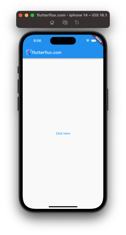
The TextButton button in Flutter is designed to look like plain, plain text on the screen. It’s very similar to FlatButton, but there isn’t a background or border around the button. When you need a button that doesn’t stand out too much but still performs its function, the TextButton widget can help.
TextButton Sample Code::
TextButton(
  onPressed: () {
    // Perform some action when the button is pressed
  },
  child: Text('Click Here'),
)
Output
ElevatedButton in Flutter
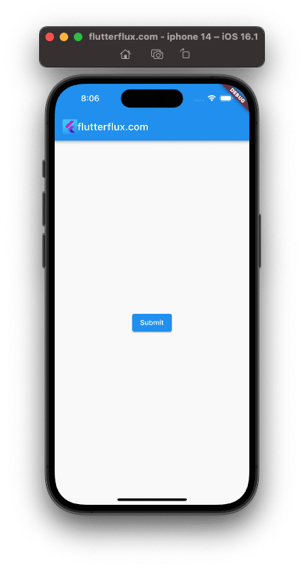
When it comes to Flutter buttons, ElevatedButton is a top pick. It’s a button with a raised appearance on the screen, thanks to material design. You can change the button color, text, and shape using the ElevatedButton widget many properties.
ElevatedButton Sample Code:
ElevatedButton(
  onPressed: () {
    // Perform some action when the button is pressed
  },
  child: Text('Submit'),
)
Output
DropdownButton in Flutter
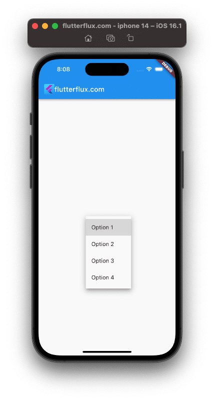
DropdownButton buttons allow users to select an item from a list. When offering choices, it’s useful. DropdownButton widget properties include color, text, and dropdown menu items.
DropdownButton Sample Code:
String dropdownValue = 'Option 1';

DropdownButton<String>(
  value: dropdownValue,
  onChanged: (String newValue) {
    setState(() {
      dropdownValue = newValue;
    });
  },
  items: <String>['Option 1', 'Option 2', 'Option 3', 'Option 4']
      .map<DropdownMenuItem<String>>((String value) {
    return DropdownMenuItem<String>(
      value: value,
      child: Text(value),
    );
  }).toList(),
)
Output
FloatingActionButton in Flutter
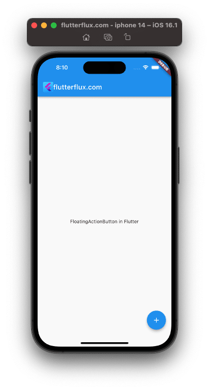
The screen floating action is provided by FloatingActionButton. It helps when creating a screen’s main action. The FloatingActionButton widget has properties for changing its color, shape, and icon.
FloatingActionButton Sample Code:
FloatingActionButton(
  onPressed: () {
    // Perform some action when the button is pressed
  },
  child: Icon(Icons.add),
)
Output
RawMaterialButton in Flutter
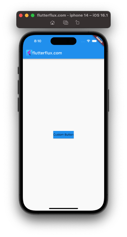
A button with a raw appearance on the screen, the RawMaterialButton. It helps when you need to make a button that doesn’t fit the typical material design. The form, height, and fillColor of the button are just a few of the properties available for manipulation in the RawMaterialButton widget.
RawMaterialButton Sample Code:
RawMaterialButton(
  onPressed: () {
    // Perform some action when the button is pressed
  },
  elevation: 2.0,
  fillColor: Colors.blue,
  child: Text('Custom Button'),
)
Output
CupertinoButton in Flutter
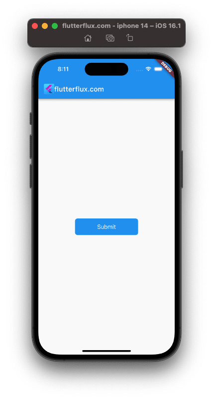
CupertinoButton is a button that mimics the look of iOS buttons. It’s helpful if you need to make a button that fits in with iOS aesthetic. Properties on the CupertinoButton widget let you change things like the button color, text, and shape to give it a unique look.
CupertinoButton Sample Code:
CupertinoButton(
  onPressed: () {
    // Perform some action when the button is pressed
  },
  color: Colors.blue,
  child: Text('Submit'),
)
Output
Conclusion
Mobile applications require buttons. Developers can use Types of Button in Flutter to create fast, attractive apps. This article covered Types of Button in Flutter TextButton, ElevatedButton, OutlinedButton, DropdownButton, FloatingActionButton, RawMaterialButton, and CupertinoButton. You can customize each button appearance and behavior for your application using its unique properties. You can create beautiful, functional mobile apps for users by understanding Types of Button in Flutter. read too How to Refresh Page in Flutter

