How to show Dialog on button click Flutter – In Flutter, a popup is a dialog box that appears on top of the current screen to show information, ask the user for input, or confirm an action. Popups are usually used to get the user’s attention on a certain message or action and require interaction before the user can move on.
Flutter popup widgets include AlertDialog, SimpleDialog, BottomSheet, and PopupMenuButton. Each widget has its own set of features and can be changed to fit the needs of your app.
An AlertDialog is one type of popup that often includes a title, message, and some sort of action and dismissal buttons. BottomSheets are popups that appear when you slide your finger up from the bottom of the screen; they can show menus or other information. When clicked, a PopupMenuButton brings up a submenu from which the user can make a selection.
To create a popup on button click in Flutter, you can use the showDialog method.
Example showDialog:
ElevatedButton(
  onPressed: () {
    showDialog(
      context: context,
      builder: (BuildContext context) {
        return AlertDialog(
          title: Text("Popup Title"),
          content: Text("Popup Content"),
          actions: <Widget>[
            ElevatedButton(
              child: Text("Close"),
              onPressed: () {
                Navigator.of(context).pop();
              },
            ),
          ],
        );
      },
    );
  },
  child: Text("Open Popup"),
)
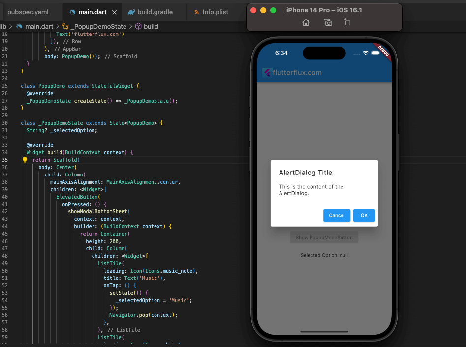
Here, we have a RaiseToTopButton that, when clicked, displays an AlertDialog in a popup. There is a title, some text, and a close button on the AlertDialog.
You can change the popup by adding more buttons, changing the content, or using a different kind of dialog widget.
Example AlertDialog:
ElevatedButton(
  onPressed: () {
    showDialog(
      context: context,
      builder: (BuildContext context) {
        return AlertDialog(
          title: Text('AlertDialog Title'),
          content: Text('This is the content of the AlertDialog.'),
          actions: <Widget>[
            ElevatedButton(
              child: Text('Cancel'),
              onPressed: () {
                Navigator.of(context).pop();
              },
            ),
            ElevatedButton(
              child: Text('OK'),
              onPressed: () {
                // Perform some action here
                Navigator.of(context).pop();
              },
            ),
          ],
        );
      },
    );
  },
  child: Text('Show AlertDialog'),
),
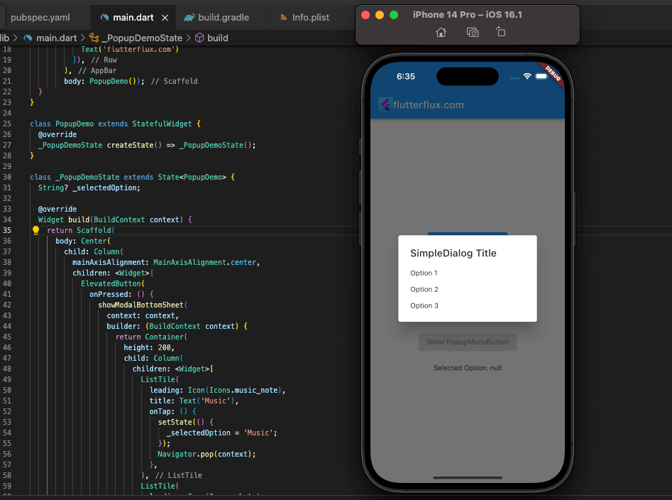
Here, we have a ElevatedButton that, when clicked, brings up an AlertDialog. The AlertDialog includes the following components: a title, some text, and cancel and OK buttons. When the user clicks “Cancel,” the dialog box closes without taking any further action. After the user confirms their selection by clicking the “OK” button, the dialog box is processed (according to the user’s instructions in the onPressed function), and then closed.
Example simpleDialog:
In Flutter, a SimpleDialog is a pop-up dialog box that displays a list of options or a message to the user. It’s similar to an AlertDialog, but without the title bar.

ElevatedButton(
  onPressed: () {
    showDialog(
      context: context,
      builder: (BuildContext context) {
        return SimpleDialog(
          title: Text('SimpleDialog Title'),
          children: <Widget>[
            SimpleDialogOption(
              onPressed: () {
                // Perform some action here
                Navigator.of(context).pop();
              },
              child: Text('Option 1'),
            ),
            SimpleDialogOption(
              onPressed: () {
                // Perform some other action here
                Navigator.of(context).pop();
              },
              child: Text('Option 2'),
            ),
            SimpleDialogOption(
              onPressed: () {
                // Perform yet another action here
                Navigator.of(context).pop();
              },
              child: Text('Option 3'),
            ),
          ],
        );
      },
    );
  },
  child: Text('Show SimpleDialog'),
),
If you click the highlighted button, a basic dialog box will pop up. Each of the three options presented in the SimpleDialog accompanying SimpleDialogOption widgets is labeled and given a corresponding title. User input triggers an action (described in the onPressed function) and then the dialog box closes.
example BottomSheet:
In Flutter, a BottomSheet is a pop-up dialog box that slides up from the bottom of the screen. It’s typically used to display a list of options or other content that the user can interact with.
ElevatedButton(
  onPressed: () {
    showModalBottomSheet(
      context: context,
      builder: (BuildContext context) {
        return Container(
          height: 200,
          child: Column(
            children: <Widget>[
              ListTile(
                leading: Icon(Icons.music_note),
                title: Text('Music'),
                onTap: () {
                  // Perform some action here
                  Navigator.pop(context);
                },
              ),
              ListTile(
                leading: Icon(Icons.photo),
                title: Text('Photos'),
                onTap: () {
                  // Perform some other action here
                  Navigator.pop(context);
                },
              ),
              ListTile(
                leading: Icon(Icons.videocam),
                title: Text('Videos'),
                onTap: () {
                  // Perform yet another action here
                  Navigator.pop(context);
                },
              ),
            ],
          ),
        );
      },
    );
  },
  child: Text('Show BottomSheet'),
),
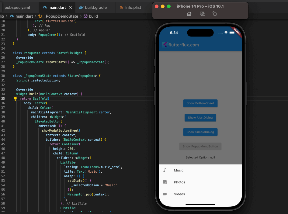
In this example, we have a RaisedButton that, when pressed, displays a BottomSheet. The BottomSheet contains a Container with a fixed height, and a Column containing three ListTile widgets, each representing an option that the user can select. When the user selects an option, some action is performed (which can be specified in the onTap function), and then the dialog is closed by calling Navigator.pop(context).
example PopupMenuButton;
Flutter PopupMenuButton display pop-up menus when pressed. It shows the user’s choices.
PopupMenuButton<String>(
  onSelected: (String result) {
    // Perform some action here
  },
  itemBuilder: (BuildContext context) => <PopupMenuEntry<String>>[
    PopupMenuItem<String>(
      value: 'option 1',
      child: Text('Option 1'),
    ),
    PopupMenuItem<String>(
      value: 'option 2',
      child: Text('Option 2'),
    ),
    PopupMenuItem<String>(
      value: 'option 3',
      child: Text('Option 3'),
    ),
  ],
),
In this example, we have a PopupMenuButton that displays a pop-up menu when pressed. The onSelected function is called when the user selects an option from the menu, and takes a String argument representing the value of the selected option. The itemBuilder function returns a list of PopupMenuEntry widgets, each representing an option in the menu. The PopupMenuItem widget is used to define each option, with a value representing the value of the option and a child representing the text or widget to display for the option.
You can customize the PopupMenuButton by changing the onSelected function or the itemBuilder function to include different options or actions.
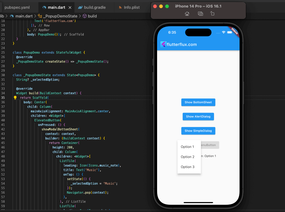
here’s an example code that demonstrates the usage of PopupMenuButton, BottomSheet, AlertDialog, SimpleDialog, and showDialog in Flutter:
import 'package:flutter/material.dclass">class PopupDemo extends StatefulWidget {
  @override
  _PopupDemoState createState() => _PopupDemoStateclass">class _PopupDemoState extends State<PopupDemo> {
  String _selectedOption;

  @override
  Widget build(BuildContext context) {
    return Scaffold(
      appBar: AppBar(
        title: Row(children: [
          Image.asset(
            'assets/logo.png',
            height: 30,
          ),
          Text('flutterflux.com')
        ]),
      ),
      body: Center(
        child: Column(
          mainAxisAlignment: MainAxisAlignment.center,
          children: <Widget>[
            ElevatedButton(
              onPressed: () {
                showModalBottomSheet(
                  context: context,
                  builder: (BuildContext context) {
                    return Container(
                      height: 200,
                      child: Column(
                        children: <Widget>[
                          ListTile(
                            leading: Icon(Icons.music_note),
                            title: Text('Music'),
                            onTap: () {
                              setState(() {
                                _selectedOption = 'Music';
                              });
                              Navigator.pop(context);
                            },
                          ),
                          ListTile(
                            leading: Icon(Icons.photo),
                            title: Text('Photos'),
                            onTap: () {
                              setState(() {
                                _selectedOption = 'Photos';
                              });
                              Navigator.pop(context);
                            },
                          ),
                          ListTile(
                            leading: Icon(Icons.videocam),
                            title: Text('Videos'),
                            onTap: () {
                              setState(() {
                                _selectedOption = 'Videos';
                              });
                              Navigator.pop(context);
                            },
                          ),
                        ],
                      ),
                    );
                  },
                );
              },
              child: Text('Show BottomSheet'),
            ),
            SizedBox(height: 20),
            ElevatedButton(
              onPressed: () {
                showDialog(
                  context: context,
                  builder: (BuildContext context) {
                    return AlertDialog(
                      title: Text('AlertDialog Title'),
                      content: Text('This is the content of the AlertDialog.'),
                      actions: <Widget>[
                        ElevatedButton(
                          child: Text('Cancel'),
                          onPressed: () {
                            Navigator.of(context).pop();
                          },
                        ),
                        ElevatedButton(
                          child: Text('OK'),
                          onPressed: () {
                            setState(() {
                              _selectedOption = 'OK';
                            });
                            Navigator.of(context).pop();
                          },
                        ),
                      ],
                    );
                  },
                );
              },
              child: Text('Show AlertDialog'),
            ),
            SizedBox(height: 20),
            ElevatedButton(
              onPressed: () {
                showDialog(
                  context: context,
                  builder: (BuildContext context) {
                    return SimpleDialog(
                      title: Text('SimpleDialog Title'),
                      children: <Widget>[
                        SimpleDialogOption(
                          onPressed: () {
                            setState(() {
                              _selectedOption = 'Option 1';
                            });
                            Navigator.of(context).pop();
                          },
                          child: Text('Option 1'),
                        ),
                        SimpleDialogOption(
                          onPressed: () {
                            setState(() {
                              _selectedOption = 'Option 2';
                            });
                            Navigator.of(context).pop();
                          },
                          child: Text('Option 2'),
                        ),
                        SimpleDialogOption(
                          onPressed: () {
                            setState(() {
                              _selectedOption = 'Option 3';
                            });
                            Navigator.of(context).pop();
                          },
                          child: Text('Option 3'),
                        ),
                      ],
                    );
                  },
                );
              },
              child: Text('Show SimpleDialog'),
            ),
            SizedBox(height: 20),
            PopupMenuButton<String>(
              onSelected: (String result) {
                setState(() {
                  _selectedOption = result;
                });
              },
              itemBuilder: (BuildContext context) => <PopupMenuEntry<String>>[
                PopupMenuItem<String>(
                  value: 'Option 1',
                  child: Text('Option 1'),
                ),
                PopupMenuItem<String>(
                  value: 'Option 2',
                  child: Text('Option 2'),
                ),
                PopupMenuItem<String>(
                  value: 'Option 3',
                  child: Text('Option 3'),
                ),
              ],
              child: ElevatedButton(
                onPressed: null,
                child: Text('Show PopupMenuButton'),
              ),
            ),
            SizedBox(height: 20),
            Text('Selected Option: $_selectedOption'),
          ],
        ),
      ),
    );
  }
}
In this example, we have a Scaffold with an AppBar and a Column in the body that contains several ElevatedButton and PopupMenuButton widgets. When a button is pressed, a corresponding pop-up dialog box (BottomSheet, AlertDialog, SimpleDialog, or PopupMenuButton) is displayed, allowing the user to select an option. The selected option is then displayed at the bottom of the screen.
Note that we’re using setState to update the _selectedOption variable whenever a new option is selected. This is necessary to trigger a re-render of the widget tree and display the updated value on the screen.
Conclusion
Show dialog on button click flutter can be programmed to do multiple things, and the dialog widget lets developers choose what those things are. A number of in-built settings are available to developers for altering the look of the dialog box, including background color, border radius, and elevation.

