Types of widgets in Flutter – Widget form the interface (UI). Buttons, text boxes, pictures, and more are UI elements. Widgets can be mixed and matched to create alternative UI layouts and designs. Even the program is a widget in Flutter. . Stateful widgets can modify their state in response to user input, while stateless widgets are unchangeable.
Flutter’s pre-built widgets make complicated UIs easy. Developers can also make custom widgets. Flutter widgets are flexible and easy to utilize, making it popular for mobile and web app development.
Types of widgets in Flutter
-
Text Widget: Renders text in the UI
A text widget is a UI component used to show text. It is a widely utilized component in Flutter apps. Using the Text widget necessitates passing in a String value to be rendered in-context.
example of using the Text widget to display a simple message:
Text(
‘Hello, world!’,
style: TextStyle(fontSize: 20),
)
In this example,
let’s create a Text widget with the text “Hello, world!” and a font size of 20. The TextStyle class is where you’ll gt size, color, and weight.
TextAlign allows you to align the text, maxLines limits the amount of lines, and overflow deals with text that extends beyond the widget’s bounds, among other attributes.
Enclosing a variable or expression in curly braces, like this:, allows you to use it within the Text widget:
Text(
  'The answer is ${2 + 2}.',
  style: TextStyle(fontSize: 20),
)
In this example, the message is “The answer is 4.” because the expression 2 + 2 is evaluated inside the curly br Widget: Displays an image in the UI
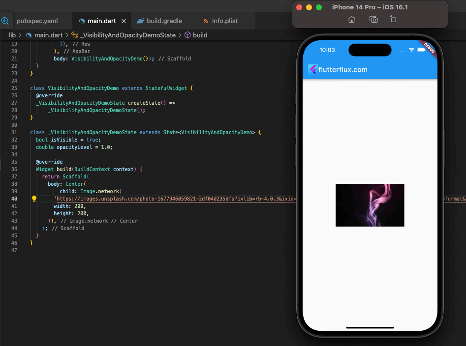
Displaying images in a user interface is the primary function of the image widget. Many picture resources, including the network, assets, and memory, can be loaded into the system.
example of using the Image widget to display an image from the network:
Image.network(
  'https://example.com/image.jpg',
  width: 200,
  height: 200,
)
In this example, we’re creating an Image widget that loads an image from the network using its URL. The width and height properties are used to set the dimensions of the image.
You can also load images from assets by using the AssetImage class:
Image(
  image: AssetImage('assets/image.png'),
  width: 200,
  height: 200,
)
In this example, we’re creating an Image widget that loads an image from the assets folder of the Flutter project. The AssetImage class is used to specify the asset path of the image.
The Image widget also provides various other properties to customize the image, such as fit to control how the image fits within its bounds, alignment to set the alignment of the image within its bounds, and more.
In addition, Flutter provides a CachedNetworkImage widget from the cached_network_image package that can be used to load and cache images from the network.
-
Button Widget: Displays a clickable button in the UI
To show a button in a user interface that may be activated by a user’s click, the ElevatedButton widget is employed. It’s a staple of Flutter apps and one of the most popular widgets developers utilize.
example of using the ElevatedButton widget to create a button:
ElevatedButton(
  onPressed: () {
    // Do something when the button is pressed
  },
  child: Text('Click me'),
)
In this example, we’re creating an ElevatedButton widget with the label “Click me”. The onPressed property is used to specify the function that will be called when the button is pressed.
You can also customize the appearance of the button using properties such as style, icon, and disabledColor. For example, here’s how to create a button with an icon:
ElevatedButton.icon(
  onPressed: () {
    // Do something when the button is pressed
  },
  icon: Icon(Icons.add),
  label: Text('Add item'),
)
In this example, we’re creating an ElevatedButton widget with an icon and a label. The onPressed property is used to specify the function that will be called when the button is pressed.
Flutter also provides other button widgets such as TextButton, OutlinedButton, and IconButton that can be used to create different types of buttons depending on your needs.
-
TextField Widget: Allows users to input text in the UI
TextField widget is used to allow users to input text in a user interface. It is one of the most commonly used widgets in Flutter applications.
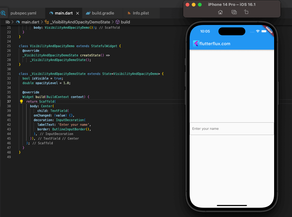
example of using the TextField widget to create a text input field:
TextField(
  onChanged: (value) {
    // Do something when the text is changed
  },
  decoration: InputDecoration(
    labelText: 'Enter your name',
    border: OutlineInputBorder(),
  ),
)
In this example, we’re creating a TextField widget with a label “Enter your name” and an outline border. The onChanged property is used to specify the function that will bhanged by the user.
You can also customize the appearance of the text input field using properties such as style, textAlign, and maxLength. For example, here’s how to create a text input field with a hint text:
TextField(
  decoration: InputDecoration(
    hintText: 'Enter your email',
    border: OutlineInputBorder(),
  ),
)
In this example, we’re creating a TextField widget with a hint text “Enter your email” and an outline border.
Flutter also provides other text input widgets such as TextFormFienoTextField that can be used to create different types of text input fields depending on your needs.
-
Checkbox Widget: Allows users to select multiple options from a list
Checkbox widget is used to allow users to select multiple options from a list in a user interface. It is one of the most commonly used widgets in Flutter applications.
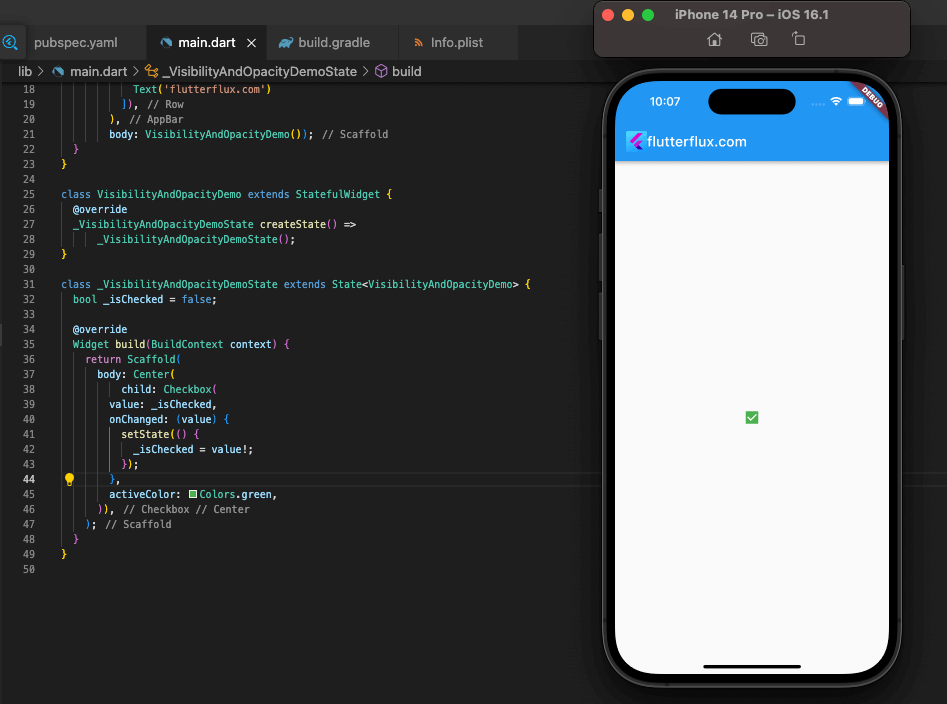
example of using the Checkbox widget to create a checkbox:
bool _isChecked = false;

Checkbox(
  value: _isChecked,
  onChanged: (value) {
    setState(() {
      _isChecked = value;
    });
  },
  title: Text('Option 1'),
)
In this example, we’re creating a Checkbox widget with a label “Option 1”. The value property is used to specify whether the checkbox is checked or not. The onChanged property is used to specify the function that will be called when the user taps on the checkbox.
You can also customize the appearance of the checkbox using properties such as activeColor, checkColor, and tristate. here’s how to create a checkbox with a custom color:
Checkbox(
  value: _isChecked,
  onChanged: (value) {
    setState(() {
      _isChecked = value;
    });
  },
  title: Text('Option 2'),
  activeColor: Colors.green,
)
In this example, we’re creating a Checkbox widget with a label “Option 2” and a custom green color.
Flutter also provides other checkbox widgets such as CheckboxListTile and CupertinoSwitch that can be used to create different types of checkboxes depending on your needs.
-
Radio Button Widget: Allows users to select a single option from a list
A radio widget is a form of user interface control that presents a single option for selection. It is a widely utilized component in Flutter apps.
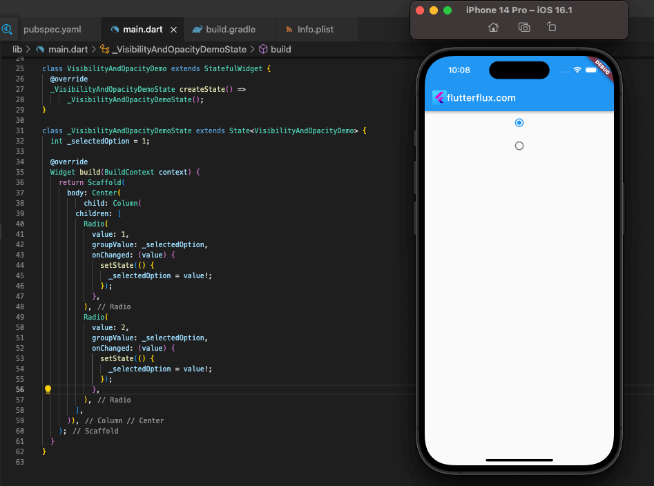
example of using the Radio widget to create a radio button:
int _selectedOption = 1;

Column(
  children: [
    Radio(
      value: 1,
      groupValue: _selectedOption,
      onChanged: (value) {
        setState(() {
          _selectedOption = value;
        });
      },
      title: Text('Option 1'),
    ),
    Radio(
      value: 2,
      groupValue: _selectedOption,
      onChanged: (value) {
        setState(() {
          _selectedOption = value;
        });
      },
      title: Text('Option 2'),
    ),
  ],
)
In this example, we’re creating two Radio widgets with labels “Option 1” and “Option 2”. The value property is used to specify the value of the radio button. The groupValue property is used to specify the currently selected option. The onChanged property is used to specify the function that will be called when the user selects an option.
You can also customize the appearance of the radio button using properties such as activeColor, materialTapTargetSize, and visualDensity. For example, here’s how to create a radio button with a custom active color:
Radio(
  value: 3,
  groupValue: _selectedOption,
  onChanged: (value) {
    setState(() {
      _selectedOption = value;
    });
  },
  title: Text('Option 3'),
  activeColor: Colors.green,
)
In this example, we’re creating a Radio widget with a label “Option 3” and a custom green color.
Flutter also provides other radio button widgets such as RadioListTile and CupertinoRadio that can be used to create different types of radio buttons depending on your needs.
-
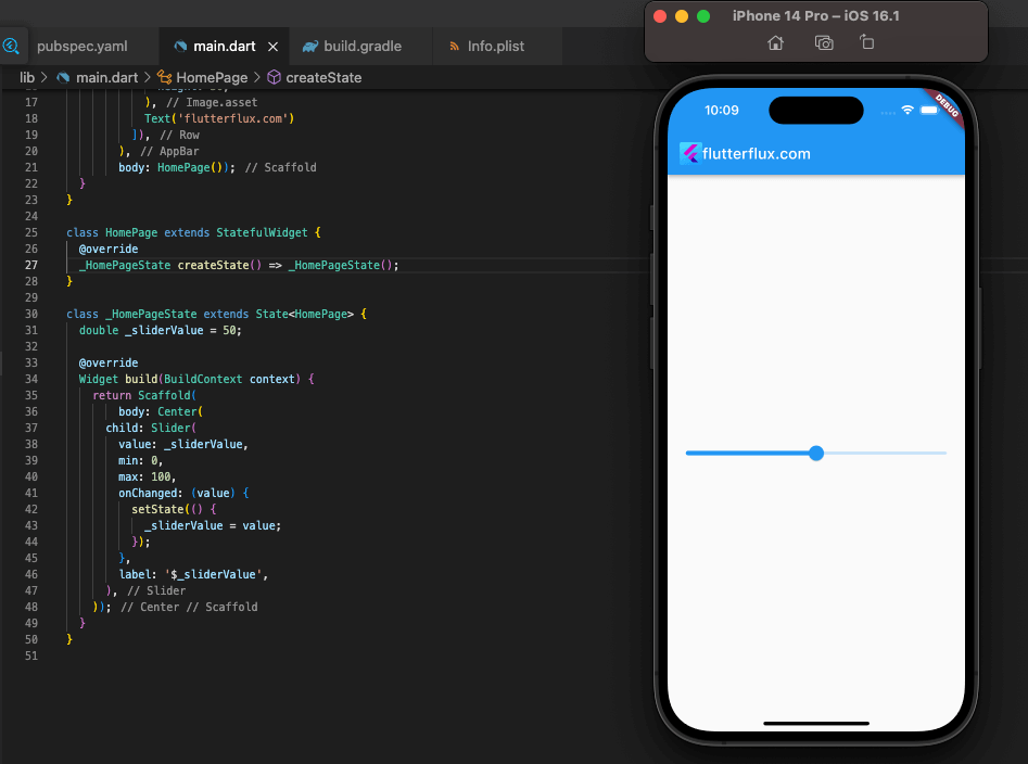
Slider Widget: Allows users to select a value from a range of values
A user interface slider widget is used to let a user choose a value from a set of possible values. The Flutter community has adopted it as a go-to widget.
example of using the Slider widget to create a slider:
double _sliderValue = 50;

Slider(
  value: _sliderValue,
  min: 0,
  max: 100,
  onChanged: (value) {
    setState(() {
      _sliderValue = value;
    });
  },
  label: '$_sliderValue',
)
In this example, we’re creating a Slider widget with a range of values from 0 to 100. The value property is used to specify the current value of the slider. The min and max properties are used to specify the minimum and maximum values of the slider. The label property is used to specify the label that appears above the slider.
You can also customize the appearance of the slider using properties such as activeColor, inactiveColor, and divisions. For example, here’s how to create a slider with a custom active color:
Slider(
  value: _sliderValue,
  min: 0,
  max: 100,
  onChanged() {
    setState(() {
      _sliderValue = value;
    });
  },
 '$_sliderValue',
  :Colors.green,
)
we’re creating a Slider widget with a custom green active color.
Flutter also provides other slider widgets such as RangeSlider aode> that can be used to create different types of sliders depending on your needs.
-
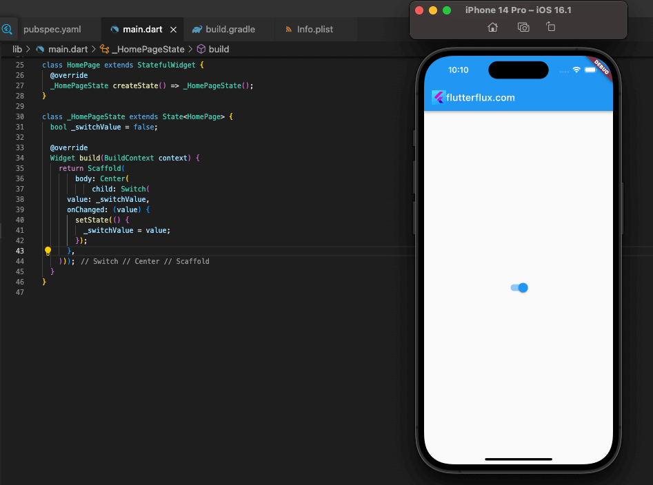
Switch Widgeetween two states
Switch widget is used to allow users to toggle between two states in a user interface. It is one of the most commonly used widgets in Flutter applications.
example of using the Switch widget to create a switch:
bool _switchValue = false;

Switch(
  value: _switchValue,
  onChanged: (value) {
    setState(() {
      _switchValue = value;
    });
  },
  title: Text('Enable feature'),
)
In this example, we’re creating a Switch widget with a label “Enable feature”. The value property is used to specify whether the switch is on or off. The onChanged property is used to specify the function that will be called when the user toggles the switch.
You can also customize the appearance of the switch using properties such as activeColor, inactiveColor, and materialTapTargetSize. For example, here’s how to create a switch with a custom active color:
Switch(
  value: _switchValue,
  onChanged: (value) {
    setState(() {
      _switchValue = value;
    });
  },
  title: Text('Enable feature'),
  activeColor: Colors.green,
)
In this example, we’re creating a Switch widget with a custom green active color.
Flutter also provides other switch widgets such as SwitchListTile and CupertinoSwitch that can be used to create different types of switches depending on your needs.
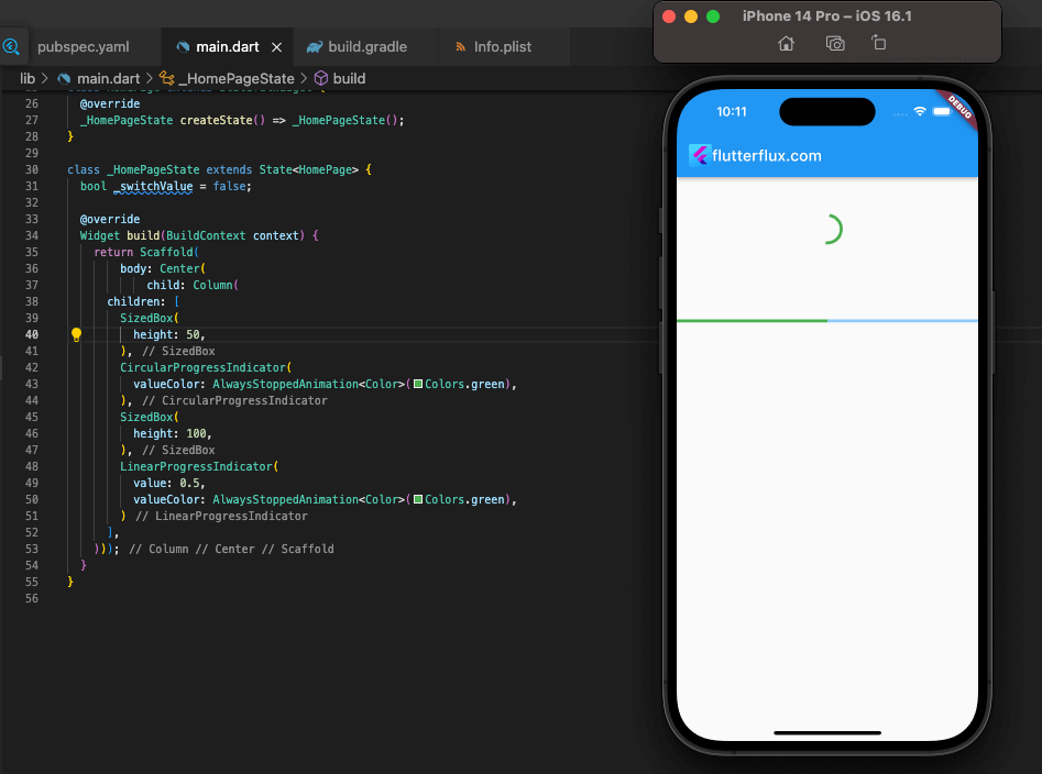
CircularProgressIndicator and LinearProgressIndicator widgets display progress bars and spinners in user interfaces. They signify a procedure is running and the user must wait.
example of using the CircularProgressIndicator widget to create a spinner:
CircularProgressIndicator()
In this example, we’re creating a CircularProgressIndicator widget that displays a spinner.
You can also customize the appearance of the spinner using properties such as valueColor, backgroundColor, and strokeWidth. For example, here’s how to create a spinner with a custom color:
CircularProgressIndicator(
  valueColor: AlwaysStoppedAnimation<Color>(Colors.green),
)
In this example, we’re creating a CircularProgressIndicator widget with a custom green color.
Here’s an example of using the LinearProgressIndicator widget to create a progress bar:
LinearProgressIndicator(
  value: 0.5,
)
In this example, we’re creating a LinearProgressIndicator widget that displays a progress bar with a value of 0.5.
You can also customize the appearance of the progress bar using properties such as valueColor, backgroundColor, and minHeight. For example, here’s how to create a progress bar with a custom color:
LinearProgressIndicator(
  value: 0.5,
  valueColor: AlwaysStoppedAnimation<Color>(Colors.green),
)
In this example, we’re creating a LinearProgressIndicator widget with a custom green color.
-
Card Widget: Displays a container with a shadow and rounded corners
Card widget is used to display a container with a shadow and rounded corners in a user interface. It is commonly used to group related content together and make it visually appealing.
example of using the Card widget to create a card:
Card(
  child: ListTile(
    leading: Icon(Icons.person),
    title: Text('John Doe'),
    subtitle: Text('[email protected]'),
    trailing: Icon(Icons.arrow_forward),
  ),
)
In this example, we’re creating a Card widget with a ListTile child that displays information about a person. The leading property is used to specify the icon that appears on the left side of the ListTile. The title and subtitle properties are used to specify the main and secondary text that appears in the ListTile. The trailing property is used to specify the icon that appears on the right side of the ListTile.
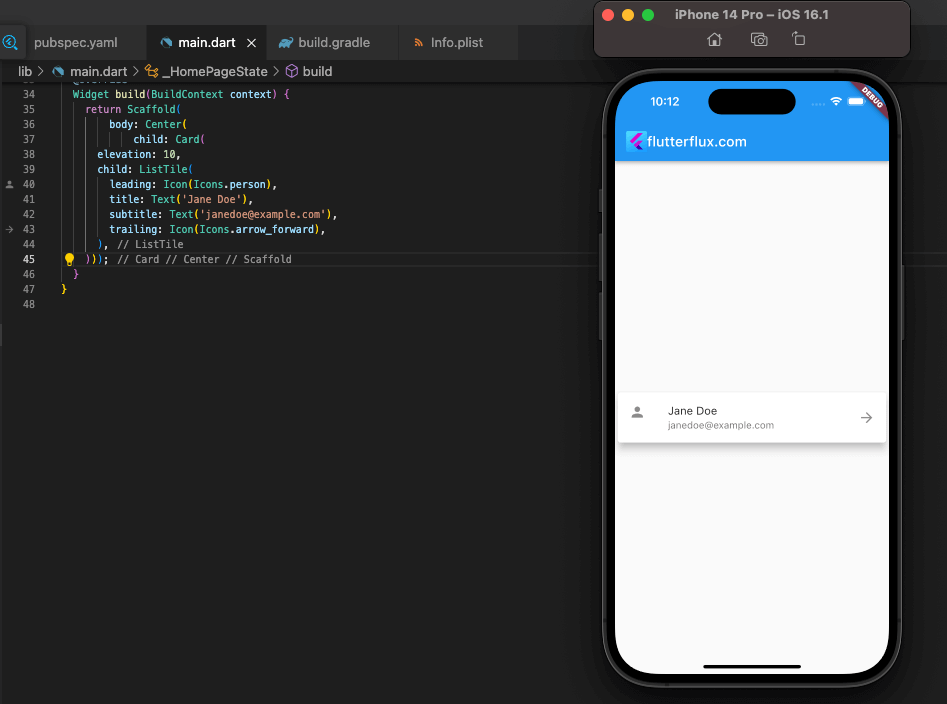
You can also customize the appearance of the card using properties such as elevation, shape, and color. For example, here’s how to create a card with a custom elevation:
Card(
  elevation: 10,
  child: ListTile(
    leading: Icon(Icons.person),
    title: Text('Jane Doe'),
    subtitle: Text('[email protected]'),
    trailing: Icon(Icons.arrow_forward),
  ),
)
In this example, we’re creating a Card widget with an elevation of 10.
Flutter also provides other card widgets such as ExpansionPanel and CupertinoActionSheet that can be used to create different types of cards depending on your needs.
-
ListView Widget: Displays a scrollable list of items
ListView widget is used to display a scrollable list of items in a user interface. It is one of the most commonly used widgets in Flutter applications for displaying large amounts of data.
example of using the ListView widget to create a simple list:
ListView(
  children: [
    ListTile(
      leading: Icon(Icons.person),
      title: Text('John Doe'),
      subtitle: Text('[email protected]'),
      trailing: Icon(Icons.arrow_forward),
    ),
    ListTile(
      leading: Icon(Icons.person),
      title: Text('Jane Doe'),
      subtitle: Text('[email protected]'),
      trailing: Icon(Icons.arrow_forward),
    ),
    ListTile(
      leading: Icon(Icons.person),
      title: Text('Bob Smith'),
      subtitle: Text('[email protected]'),
      trailing: Icon(Icons.arrow_forward),
    ),
  ],
)
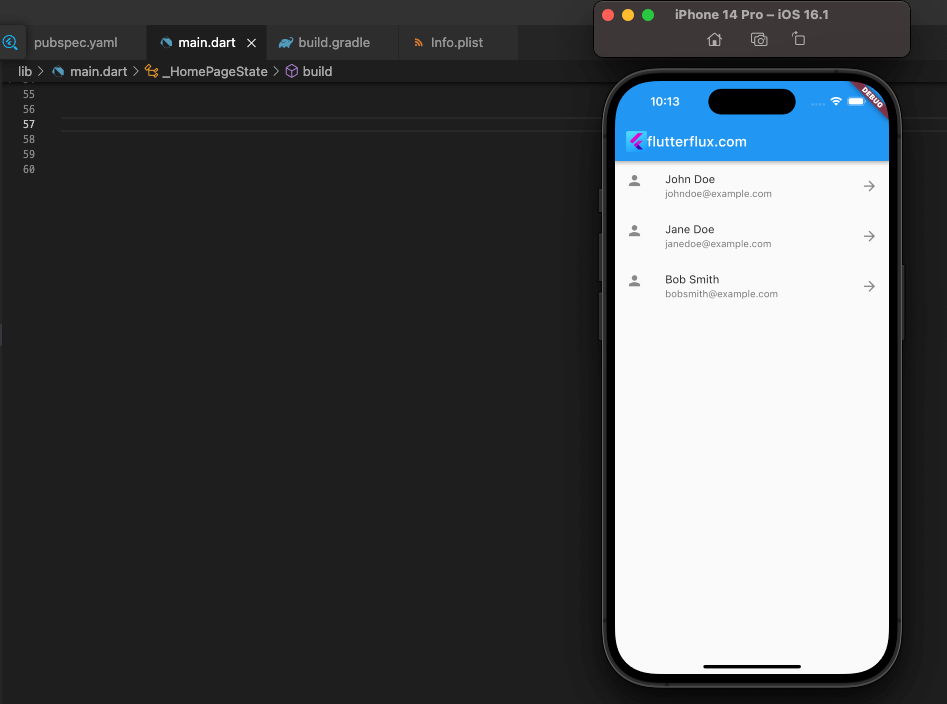
In this example, we’re creating a ListView widget with three ListTile children that display information about people. Each ListTile has an icon, a main text, a secondary text, and a trailing icon.
You can also customize the appearance of the list using properties such as scrollDirection, padding, and
-
GridView Widget: Displays a scrollable grid of items
GridView widget in Flutter allows you to create a grid of widgets with a fixed number of columns. It is useful for displaying a collection of items, such as images or text, in a grid format.
The Grid View widget requires you to first compile a set of data to be shown in a grid. Then, you can give the Grid View widget both the list and the number of columns you wish to see.
example of how to use the Grid View widget in Flutter:
import 'package:flutter/material.dart';

void main() {
  runApp(MyApp());
}

class MyApp extends StatelessWidget {
  @override
  Widget build(BuildContext context) {
    return MaterialApp(
      home: Scaffold(
        appBar: AppBar(title: Text('Grid View Example')),
        body: GridView.count(
          crossAxisCount: 3,
          children: List.generate(9, (index) {
            return Container(
              color: Colors.blueGrey,
              margin: EdgeInsets.all(10),
              child: Center(
                child: Text(
                  'Item $index',
                  style: TextStyle(color: Colors.white, fontSize: 24),
                ),
              ),
            );
          }),
        ),
      ),
    );
  }
}
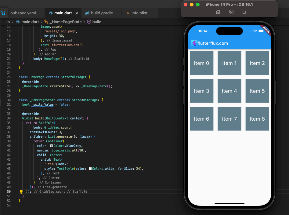
Here, we make a simple grid with three column and nine cells. Ther> backdrop color, a 10 margin, and white lettering in the middle of each item that specifies its index. To build the list of things, we use the List.generate method and provide it the target number of items to display.
The Grid View widget’s attributes allow you to change the widget’s appearance and layout to meet your needs. The mainAxisSpacing and crossAxisSpacing parameters allow you to modify the distance between items, while the childAspectRatio property allows you to modify the aspect ratio of individual items.
-
Stack Widget: Allows widgets to be stacked on top of each other in the UI
With Flutter, you may stack widgets on top of one another to create a hierarchical layout. It’s helpful for making elaborate layouts in which widgets need to overlap or be positioned in unusual ways.
The Stack widget is used by enclosing other widgets within it and then positioning them in relation to the widget’s top, bottom, left, or right boundaries with the Positioned widget.
example of how to use the Stack widget in Flutter:
import 'package:flutter/material.dart';

void main() {
  runApp(MyApp());
}

class MyApp extends StatelessWidget {
  @override
  Widget build(BuildContext context) {return MaterialApp(
      home: Scaffold(
        appBar: AppBar(title: Text('Stack Example')),
        body: Stack(
          children: [
            Container(
              color: Colors.blueGrey,
              height: 200,
              width: 200,
            ),
            Positioned(
              top: 50,
              left: 50,
              child: Text(
                'Hello',
                style: TextStyle(
                  color: Colors.white,
                  fontSize: 24,
                ),
              ),
            ),
            Positioned(
              bottom: 50,
              right: 50,
                'World',
                style: TextStyle(
                  color: Colors.white,
                  fontSize: 24,
                ),
              ),
            ),
          ],
        ),
      ),
    );
  }
}
Here, we’ll create a Stack widget with a gray-blue container and two text widgets in widgets are spaced 50px from the stack’s left and right corners; the first one is placed 50px in from the top.
Changing the properties of the widgets in the stack allows you to alter the stack’s visual style and layout. The container’s size and color, as well as the placement and appearance of the text widgets, are only two examples.
-
Tab Bar Widget: Displays a tab bar with multiple tabs
TabBar widget in Flutter is used to display a set of tabs that can be used to switch between different views or screens. It is a part of the Material Design widgets in Flutter and is used for creating tabbed interfaces.
When working with the TabBar widget, it is necessary to first create a TabController object to handle the tabs’ states. You can set the active tab’s starting index and subscribe to its selection status changes with the TabController object.
example of how to use the TabBar widget in Flutter:
class MyTabbedPage extends StatefulWidget {
  @override
  _MyTabbedPageState createState() => _MyTabbedPageState();
}

class _MyTabbedPageState extends State<MyTabbedPage> with SingleTickerProviderStateMixin {
  TabController _tabController;

  @override
  void initState() {
    super.initState();
    _tabController = TabController(vsync: this, length: 2);
  }

  @override
  Widget build(BuildContext context) {
    return Scaffold(
      appBar: AppBar(
        bottom: TabBar(
          controller: _tabController,
          tabs: [
            Tab(icon: Icon(Icons.directions_car)),
            Tab(icon: Icon(Icons.directions_transit)),
          ],
        ),
        title: Text('Tabbed Page'),
      ),
      body: TabBarView(
        controller: _tabController,
        children: [
          Icon(Icons.directions_car),
          Icon(Icons.directions_transit),
        ],
      ),
    );
  }

  @override
  void dispose() {
    _tabController.dispose();
    super.dispose();
  }
}
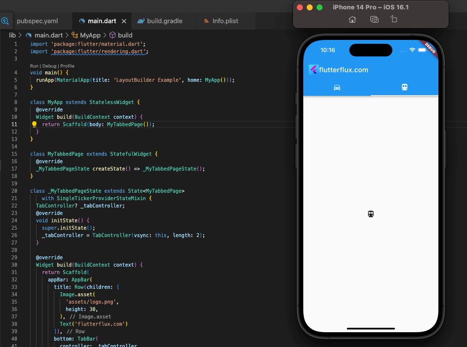
In this example, we create a MyTabbedPage widget that has an AppBar with a TabBar widget as its bottom property. We also create a TabBarView widget that displays the content of each tab.
We create a TabController object in the initState method and pass it to both the TabBar and TabBarView widgets. We also implement the SingleTickerProviderStateMixin mixin to provide a TickerProvider for the TabController.
Finally, we dispose of the TabController object in the dispose method to prevent memory leaks.
Overall, the TabBar widget in Flutter is a powerful tool for creating tabbed interfaces and switching between different views or screens.
-
Drawer Widget: Displays a slide-out menu from the side of the screen.
The Flutter Drawer widget is used to reveal a left-side menu when the user swipes from the screen’s left edge or presses a button. It’s a widget included in Flutter’s Material Design widgets and it’s used to make menus for apps.
Create a Scaffold widget consisting of an AppBar and a Drawer widget for usage with the Drawer widget. The Drawer widget provides a menu from which the user can select various options, such as launching new windows or initiating certain tasks.
example of how to use the Drawer widget in Flutter:
class MyDrawerPage extends StatefulWidget {
  @override
  _MyDrawerPageState createState() => _MyDrawerPageState();
}

class _MyDrawerPageState extends State<MyDrawerPage> {
  @override
  Widget build(BuildContext context) {
    return Scaffold(
      appBar: AppBar(
        title: Text('Drawer Page'),
      ),
      drawer: Drawer(
        child: ListView(
          padding: EdgeInsets.zero,
          children: [
            DrawerHeader(
              decoration: BoxDecoration(
                color: Colors.blue,
              ),
              child: Text(
                'Drawer Header',
                style: TextStyle(
                  color: Colors.white,
                  fontSize: 24,
                ),
              ),
            ),
            ListTile(
              leading: Icon(Icons.home),
              title: Text('Home'),
              onTap: () {
                // Navigate to home screen
              },
            ),
            ListTile(
              leading: Icon(Icons.settings),
              title: Text('Settings'),
              onTap: () {
                // Navigate to settings screen
              },
            ),
          ],
        ),
      ),
      body: Center(
        child: Text('Drawer Page'),
      ),
    );
  }
}
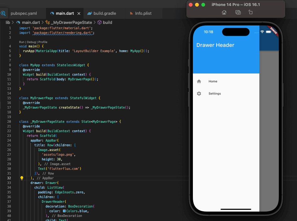
Here, we’ll develop a MyDrawerPage widget that utilizes a Scaffold, AppBar, and Drawer widget for its body. We also make a ListView widget with a DrawerHeader and two ListTile widgets and place it inside the Drawer widget.
ListTile widgets are used to display individual items within the drawer, while the DrawerHeader widget is used to display a header at the top of the drawer. We also equip the ListTile widgets with onTap handlers, which allow the user to switch between screens by tapping on a tile.
To finish off, we’ll give the Scaffold widget a body to show off the page’s content.
As a whole, the Flutter Drawer widget is an excellent means of making your app’s menus and quick links to various screens and functions readily accessible.


