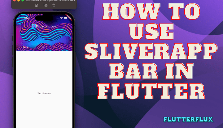
flexible and collapsible app bar that can be used in a CustomScrollView, SliverAppBar in Flutter is a widget in Flutter. As the user navigates a list or grid of content, the app bar remains in view thanks to this method.
A Material Design appBar, the SliverAppBar, can be used in conjunction with a CustomScrollView to provide additional space and a customizable header for the scrolling view. Some typical characteristics of a SliverAppBar in Flutter are as follows:
leading: The widget to display before thetitle.title: The widget to display as the title of the app bar.actions: A list of widgets to display after thetitle.backgroundColor: The background color of the app bar.elevation: The shadow depth of the app bar.brightness: The appBar brightness, which might beBrightness.lightorBrightness.dark.expandedHeight: The height of the app bar when it is fully expanded.flexibleSpace: A widget that is shown behind the app bar’s title and actions when the app bar is scrolled.floating: Whether the app bar should “float” above the content, i.e. whether it should remain visible when the content is scrolled.pinned: Whether the app bar should remain pinned to the top of the viewport when the content is scrolled.snap: Whether the app bar should snap into place when it is scrolled off screen.
With these settings, you may alter a SliverAppBar appearance and behavior to better suit your app’s aesthetic and user experience.
SliverAppBar in Flutter widget is quite similar to the standard AppBar, but it has been modified so that it can be used with content that scrolls. Among the many features it allows for are:
SliverAppBar is a widget used to make an app bar that collapses yet stays on screen while the user browses a list. You can use this material in a CustomScrollView widget; it’s included in the flutter/material.dart package.
SliverAppBar in Flutter Example
import 'package:flutter/material.dart';

void main() {
  runApp(MyApp());
}

class MyApp extends StatelessWidget {
  @override
  Widget build(BuildContext context) {
    return MaterialApp(title: 'flutterflux', home: MyHomePage());
  }
}

class MyHomePage extends StatefulWidget {
  const MyHomePage({super.key});

  @override
  State createState() => _MyHomePageState();
}

class _MyHomePageState extends State {
  @override
  Widget build(BuildContext context) {
    return Scaffold(
      body: CustomScrollView(
        slivers: [
          SliverAppBar(
            title: Text('Flutterflux.com'),
            expandedHeight: 200.0,
            flexibleSpace: FlexibleSpaceBar(
              background: Image.network(
                'https://images.unsplash.com/photo-1679189792474-6c2796dc78ab?ixlib=rb-4.0.3&ixid=MnwxMjA3fDB8MHxwaG90by1wYWdlfHx8fGVufDB8fHx8&auto=format&fit=crop&w=1228&q=80',
                fit: BoxFit.cover,
              ),
            ),
          ),
          SliverList(
            delegate: SliverChildListDelegate(
              List.generate(
                20,
                (index) => ListTile(title: Text('Item $index')),
              ),
            ),
          ),
        ],
      ),
    );
  }
}
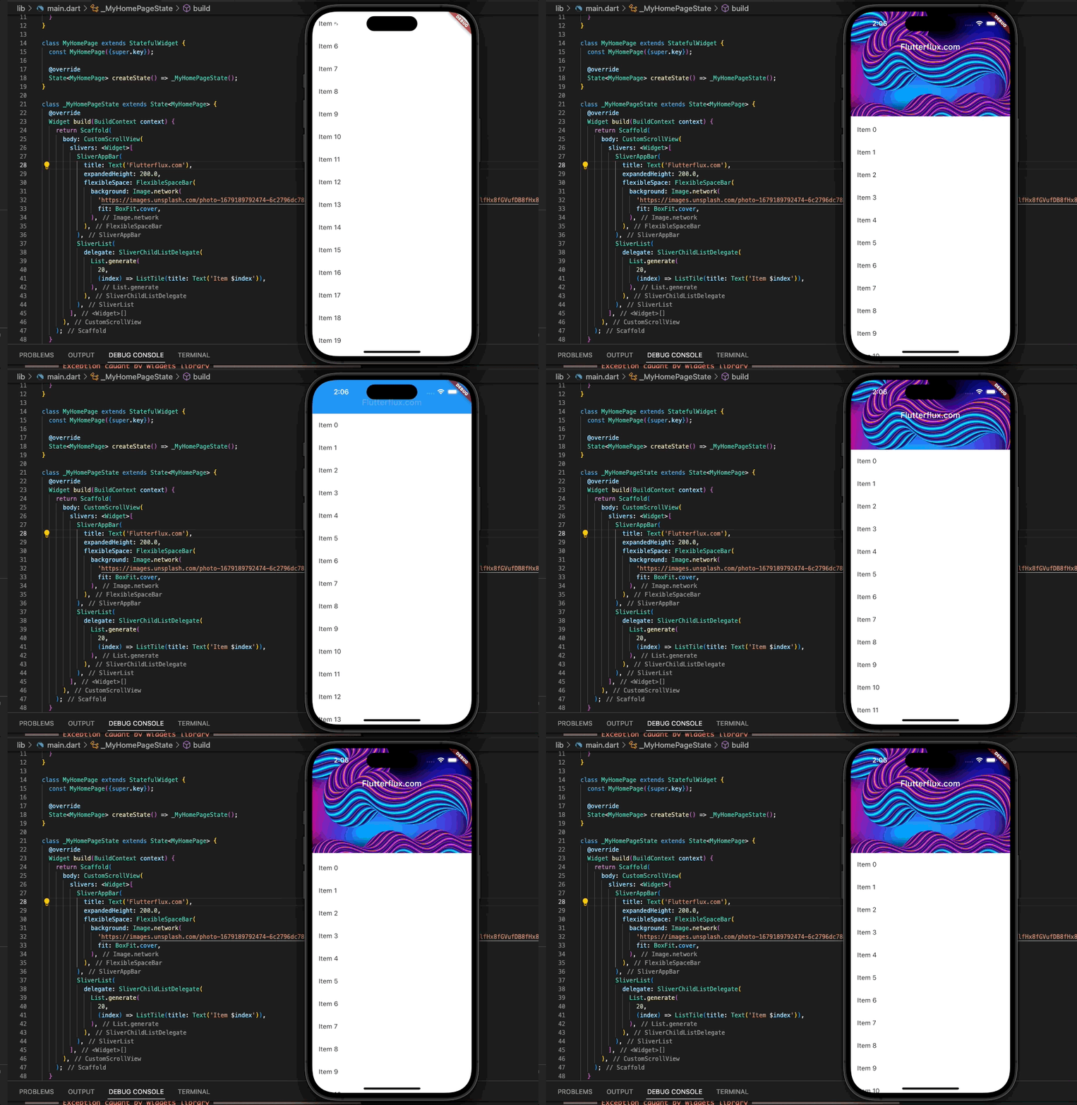
SliverAppBar in this case is labeled, has a height of 220.0, and may be customized to accommodate a full-screen image. Twenty things are listed in the SliverList widget. If the user scrolls down the list, the appbar will disappear or stay at the top.
SliverAppBar in Flutter with Search
if you want create custom SliverAppBar in Flutter with Search, you can use the SliverAppBar in Flutter widget and a TextField widget for the search bar.
Example code:
import 'package:flutter/material.dart';

void main() {
  runApp(MyApp());
}

class MyApp extends StatelessWidget {
  @override
  Widget build(BuildContext context) {
    return MaterialApp(title: 'flutterflux', home: MyHomePage());
  }
}

class MyHomePage extends StatefulWidget {
  const MyHomePage({super.key});

  @override
  State createState() => _MyHomePageState();
}

class _MyHomePageState extends State {
  @override
  Widget build(BuildContext context) {
    return Scaffold(
      body: CustomScrollView(
        slivers: [
          CustomSliverAppBar(),
          SliverList(
            delegate: SliverChildListDelegate(
              List.generate(
                20,
                (index) => ListTile(title: Text('Item $index')),
              ),
            ),
          ),
        ],
      ),
    );
  }
}

class CustomSliverAppBar extends StatefulWidget {
  @override
  _CustomSliverAppBarState createState() => _CustomSliverAppBarState();
}

class _CustomSliverAppBarState extends State {
  bool _showSearchBar = false;
  TextEditingController _searchController = TextEditingController();

  @override
  void dispose() {
    _searchController.dispose();
    super.dispose();
  }

  @override
  Widget build(BuildContext context) {
    return SliverAppBar(
      backgroundColor: Colors.deepPurple,
      pinned: true,
      expandedHeight: 120,
      flexibleSpace: FlexibleSpaceBar(
        titlePadding: EdgeInsets.only(left: 16, bottom: 16),
        title: _showSearchBar
            ? _buildSearchBar()
            : Row(children: [
                Image.asset(
                  'assets/logo.png',
                  height: 30,
                ),
                Text('flutterflux.com')
              ]),
        centerTitle: false,
      ),
      actions: [
        IconButton(
          icon: _showSearchBar ? Icon(Icons.close) : Icon(Icons.search),
          onPressed: () {
            setState(() {
              _showSearchBar = !_showSearchBar;
            });
          },
        ),
      ],
    );
  }

  Widget _buildSearchBar() {
    return TextField(
      controller: _searchController,
      decoration: InputDecoration(
        hintText: 'Search',
        border: InputBorder.none,
        contentPadding: EdgeInsets.only(top: 8, bottom: 8),
        prefixIcon: Icon(Icons.search),
        suffixIcon: IconButton(
          icon: Icon(Icons.close),
          onPressed: () {
            setState(() {
              _showSearchBar = false;
              _searchController.clear();
            });
          },
        ),
      ),
    );
  }
}
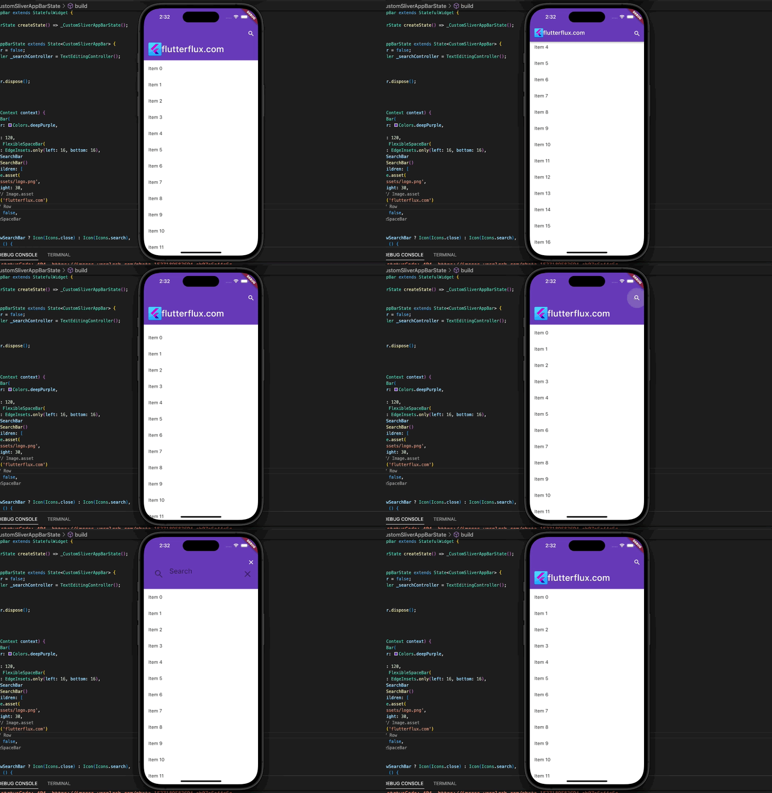
The CustomSliverAppBar widget bool variable _showSearchBar toggles when the search icon is tapped. Instead of the title, _showSearchBar displays the search bar.
A TextField widget implements the search bar, and the _searchController retrieves user input. A clear button in the search bar clears the text and hides it.
SliverAppBar in Flutter with TabBar
Use the NestedScrollView widget in Flutter to attach a TabBar to a SliverAppBar in Flutter.
Example code:
import 'package:flutter/material.dart';

void main() {
  runApp(MyApp());
}

class MyApp extends StatelessWidget {
  @override
  Widget build(BuildContext context) {
    return MaterialApp(title: 'flutterflux', home: MyHomePage());
  }
}

class MyHomePage extends StatefulWidget {
  @override
  _MyHomePageState createState() => _MyHomePageState();
}

class _MyHomePageState extends State
    with SingleTickerProviderStateMixin {
  TabController? _tabController;

  @override
  void initState() {
    super.initState();
    _tabController = TabController(length: 3, vsync: this);
  }

  @override
  void dispose() {
    _tabController!.dispose();
    super.dispose();
  }

  @override
  Widget build(BuildContext context) {
    return Scaffold(
      body: CustomScrollView(
        slivers: [
          SliverAppBar(
            title: Row(mainAxisAlignment: MainAxisAlignment.center, children: [
              Image.asset(
                'assets/logo.png',
                height: 30,
              ),
              Text('flutterflux.com')
            ]),
            floating: true,
            expandedHeight: 200.0,
            flexibleSpace: FlexibleSpaceBar(
              background: Image.network(
                'https://images.unsplash.com/photo-1679209815180-f36856a4ff77?ixlib=rb-4.0.3&ixid=MnwxMjA3fDB8MHxwaG90by1wYWdlfHx8fGVufDB8fHx8&auto=format&fit=crop&w=1170&q=80',
                fit: BoxFit.cover,
              ),
            ),
            bottom: TabBar(
              controller: _tabController,
              tabs: [
                Tab(text: 'Tab 1'),
                Tab(text: 'Tab 2'),
                Tab(text: 'Tab 3'),
              ],
            ),
          ),
          SliverFillRemaining(
            child: TabBarView(
              controller: _tabController,
              children: [
                Container(
                  child: Center(
                    child: Text('Tab 1 Content'),
                  ),
                ),
                Container(
                  child: Center(
                    child: Text('Tab 2 Content'),
                  ),
                ),
                Container(
                  child: Center(
                    child: Text('Tab 3 Content'),
                  ),
                ),
              ],
            ),
          ),
        ],
      ),
    );
  }
}
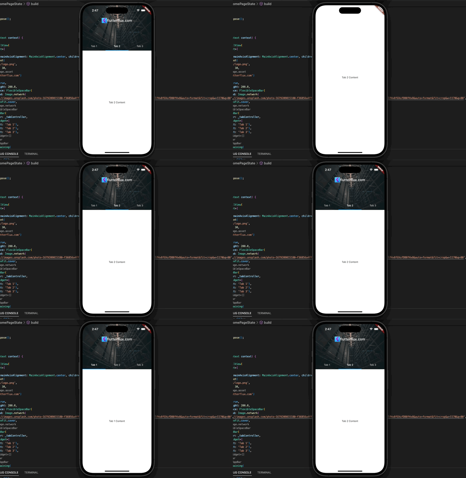
The TabBar and TabBarView operate together because we utilize a StatefulWidget to handle the TabController. The TabController and SingleTickerProviderStateMixin for vsync are initialized in initState(). In dispose, the TabController is also dispose().
In build(), we utilize a CustomScrollView with two slivers: SliverAppBar and SliverFillRemaining. SliverAppBars have titles, flexible spaces with images, and tabbar. The TabController is passed to the TabBar and TabBarView via the controller attribute. The TabBar has 3 Tab widget and the TabBarView contains three Container widget with text for each tab’s content.
SliverAppBar in Flutter Drawer
The NestedScrollView widget in Flutter lets you create a SliverAppBar with a drawer and a scrollable body.
Example code:
import 'package:flutter/material.dart';

void main() {
  runApp(MyApp());
}

class MyApp extends StatelessWidget {
  @override
  Widget build(BuildContext context) {
    return MaterialApp(title: 'flutterflux', home: MyHomePage());
  }
}

class MyHomePage extends StatefulWidget {
  @override
  _MyHomePageState createState() => _MyHomePageState();
}

class _MyHomePageState extends State {
  @override
  void initState() {
    super.initState();
  }

  @override
  void dispose() {
    super.dispose();
  }

  @override
  Widget build(BuildContext context) {
    return Scaffold(
      body: NestedScrollView(
          headerSliverBuilder: (BuildContext context, bool innerBoxIsScrolled) {
            return [
              SliverAppBar(
                title: Row(children: [
                  Image.asset(
                    'assets/logo.png',
                    height: 30,
                  ),
                  Text('flutterflux.com')
                ]),
                pinned: true,
                floating: true,
                expandedHeight: 200.0,
                snap: true,
                leading: IconButton(
                  icon: Icon(Icons.menu),
                  onPressed: () => Scaffold.of(context).openDrawer(),
                ),
              ),
            ];
          },
          body: ListView.builder(
            itemCount: 100,
            itemBuilder: (BuildContext context, int index) {
              return ListTile(
                title: Text('Item $index'),
              );
            },
          )),
      drawer: Drawer(
        child: ListView(
          padding: EdgeInsets.zero,
          children: [
            DrawerHeader(
              child: Text('Drawer Header'),
              decoration: BoxDecoration(
                color: Colors.blue,
              ),
            ),
            ListTile(
              title: Text('Item 1'),
              onTap: () {
                Navigator.pop(context);
              },
            ),
            ListTile(
              title: Text('Item 2'),
              onTap: () {
                Navigator.pop(context);
              },
            ),
          ],
        ),
      ),
    );
  }
}
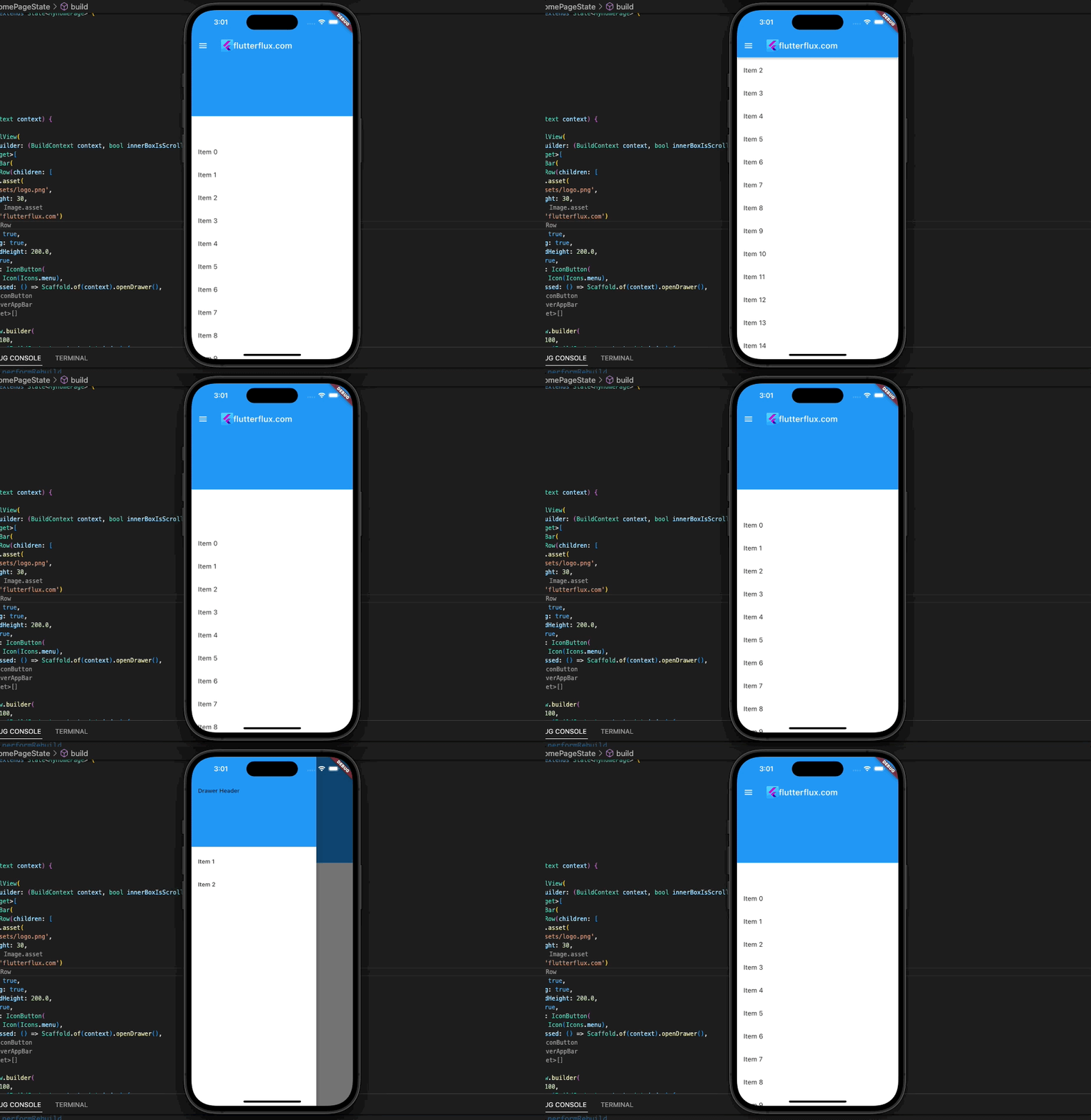
NestedScrollView wraps the SliverAppBar and body in this example. The headerSliverBuilder and body parameters define the SliverAppBar and scrollable app body, respectively.
SliverAppBar leading parameter defines the menu icon, and onPressed opens the drawer. Drawer and ListView widgets specify the drawer and its contents.
Navigator.pop(context) in each ListTile widget onTap argument closes the drawer when an item is selected.
Conclusion
To customize your app bar, SliverAppBar in Flutter allows you to insert a title, background image, preceding and following widgets, and more. The appBar behavior during scrolling can also be modified, including concealing, extending, and fixing it at the top of the screen.
Finally, if you’re a Flutter developer who wants to make beautiful and interesting scrollable content with an app bar that you can tweak, then you need SliverAppBar in Flutter.

