Divider in Flutter refers to a widget that creates a separation between two parts of the screen by drawing either a horizontal or vertical line. It typically appears as a slender line that measures one pixel in height or width, depending on its orientation, and can be modified using properties like color, thickness, and indent.
Divider are commonly utilized to enhance the visual appeal of a user interface by creating distinctions between various sections. They may be employed to create boundaries between different elements in a list or to separate a header from content in a layout.
Example of using a Basic Divider in Flutter
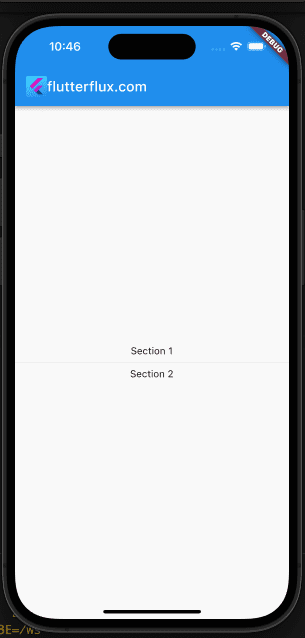
Column(
          mainAxisAlignment: MainAxisAlignment.center,
          children: [
            Text('Section 1'),
            Divider(
              thickness: 2,
            ), // A horizontal Divider
            Text('Section 2'),
          ],
        ))
Divider Design
Divider in Flutter is a basic line that has a default height or width of 1 pixel, depending on its orientation. Nonetheless, there are numerous methods to personalize its appearance to suit your application’s style and branding.
Below are a few techniques to style the Divider in Flutter:
Change the thickness:
Use the thickness property to adjust the vertical and horizontal dimensions of the divider line. By choosing thickness: 2, for instance, you can make the line twice as thick as it normally is.
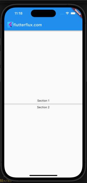
Divider(
  thickness: 2,
),
Change the color:
The color attribute allows you to modify the line color used by the Divider. This could be one continuous color or a gradient.
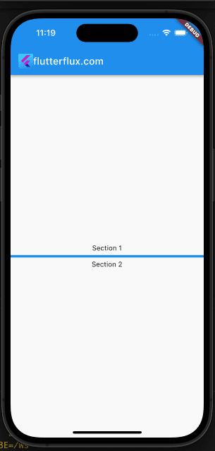
Divider(
  color: Colors.blue,
),
Add an indent:
you can add space before the Divider line. This is beneficial if you want to create an indentation between the line and the left or right edge of the screen.
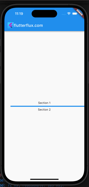
Divider(
  indent: 16,
),
Add padding:
If you’d want some breathing room on each side of your divider line, you can wrap the Divider widget with a Padding widget.
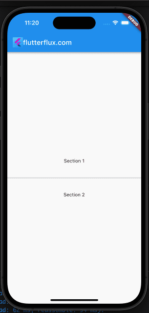
Padding(
  padding: EdgeInsets.symmetric(vertical: 8),
  child: Divider(),
),
Vertical Divider
In addition to the horizontal Divider, the VerticalDivider widget is available in Flutter for creating vertical lines between sections of information. The VerticalDivider widget is functionally equivalent to the Divider widget, but it generates a vertical line rather than a horizontal one.
Example of using a VerticalDivider in Flutter:
Row(
  children: [
    Expanded(child: Text('Left side')),
    VerticalDivider(), // A vertical Divider
    Expanded(child: Text('Right side')),
  ],
)
Similar to the horizontal Divider, the VerticalDivider widget can be tailored with characteristics such as color, thickness, indent, and height. These properties can be leveraged to fine-tune the vertical line’s appearance to suit your apps layout.
Dotted line Divider
In Flutter, you may make a dashed line separator without installing a package by calling the drawLine function on a Paint object from the CustomPainter class.
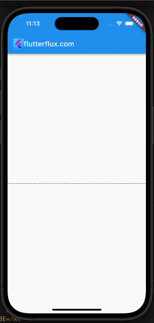
Example code:
import 'package:flutter/material.dart';

class DottedLineDivider extends StatelessWidget {
  final double height;
  final Color color;
  final double thickness;
  final double dashWidth;
  final double dashSpace;

  DottedLineDivider({
    this.height = 1,
    this.color = Colors.grey,
    this.thickness = 1,
    this.dashWidth = 5,
    this.dashSpace = 3,
  });

  @override
  Widget build(BuildContext context) {
    return CustomPaint(
      size: Size.infinite,
      painter: DottedLinePainter(
        color: color,
        thickness: thickness,
        dashWidth: dashWidth,
        dashSpace: dashSpace,
      ),
    );
  }
}

class DottedLinePainter extends CustomPainter {
  final Color color;
  final double thickness;
  final double dashWidth;
  final double dashSpace;

  DottedLinePainter({
    required this.color,
    required this.thickness,
    required this.dashWidth,
    required this.dashSpace,
  });

  @override
  void paint(Canvas canvas, Size size) {
    final paint = Paint()
      ..color = color
      ..strokeWidth = thickness
      ..style = PaintingStyle.stroke
      ..strokeCap = StrokeCap.round;

    final double totalDashSpace = dashSpace + dashWidth;
    final double dashCount = size.width / totalDashSpace;

    for (var i = 0; i < dashCount; i++) {
      final double startX = i * totalDashSpace;
      final double endX = startX + dashWidth;
      canvas.drawLine(Offset(startX, size.height / 2), Offset(endX, size.height / 2), paint);
    }
  }

  @override
  bool shouldRepaint(DottedLinePainter oldDelegate) {
    return oldDelegate.color != color ||
        oldDelegate.thickness != thickness ||
        oldDelegate.dashWidth != dashWidth ||
        oldDelegate.dashSpace != dashSpace;
  }
}
You can then use the DottedLineDivider widget as follows:
DottedLineDivider(
  height: 1,
  color: Colors.deepPurple,
  thickness: 1,
  dashWidth: 5,
  dashSpace: 3,
)
This will generate a vertical dotted line separator 1px in height, 1px in thickness, 5px in dash width, and 3px in dash space in deepPurple. Change these numbers to make your dotted line divider look exactly how you want it to.
Conclusion
Especially useful in structured views and lists, Flutter Divider makes it easy to visually distinguish between sections of material. The Divider widget lets you insert a horizontal line with modifiable attributes like size and color. Inserting a Divider widget after a list’s final item or content section’s closing brace is all that’s needed to add a divider in Flutter.

