This blog will compare Container vs Sizedbox and explain when to utilise each. UI widgets in Flutter typically need spacing or layout constraints. SizedBox and Container are popular widgets. Both widgets can add spacing and limitations, but they have different uses, so choose the proper one.
Container vs Sizedbox in Flutter
What is SizedBox?
SizedBox widgets allow developers to set widget sizes. Height and width are required. These settings let developers size additional widgets in the SizedBox container. This widget is handy for setting a widget fixed size or padding or spacing around other widget.
Definition and basic usage
SizedBox is a box widget. It sets widget dimensions or adds space between widget.
SizedBox widget render boxes with exact width and height. The following code snippet produces a SizedBox widget with 250 pixels wide and 150 pixels high:
SizedBox(
  width: 250,
  height: 150,
);
This creates a 250×150 box. If you simply wish to set width or height, use one argument. Such as:
SizedBox(
  height: 150,
);
The parent widget determines the width of this 150.
Wrapping SizedBox around a widget creates space between widgets. Such as:
Column(
  children: [
    Text('Widget 1'),
    SizedBox(height: 40),
    Text('Widget 2'),
  ],
);
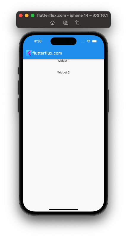
This will build a Column with two Text widget and a SizedBox with a 40-pixel height between them. Space will be added between the Text widgets.
When to use SizedBox?
You can use SizedBox in Flutter whenever you need to create a fixed size box or add space between widgets.
Here are some common use cases for SizedBox:
- Creating fixed size widgets:
SizedBoxcan define the width and height of a widget.SizedBoxcan be used to create a fixed-size button that users cannot adjust. - Adding space between widget:
SizedBoxcan space layout widgets.SizedBoxcan be used to space widget rows and columns. - Creating empty space:
SizedBoxcreates layout space.SizedBoxcan add padding around a screen’s edges or establish margins between the screen’s edge and the layout’s contents. - Creating a placeholder: As a placeholder for a widget,
SizedBoxcan be used. To reserve space for an asynchronously loaded image, useSizedBox.
SizedBox is helpful for creating fixed-size boxes or adding space between widgets. For more complicated layout behaviour, you may need to employ other widgets or combinations of widget.
Examples of using SizedBox
Here examples using SizedBox in Flutter:
- Creating a fixed size container:
SizedBox(
  width: 250,
  height: 150,
  child: Container(
    color: Colors.amber,
  ),
);
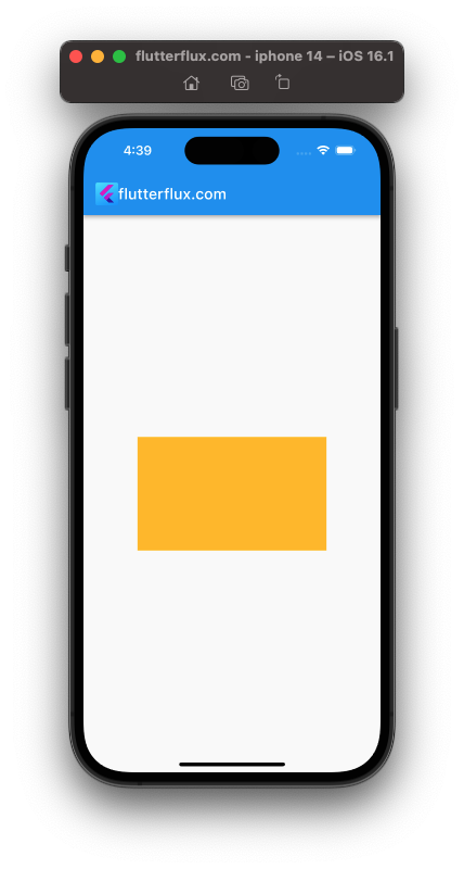
This code makes a 250×150 SizedBox. amber-background Containers are in SizedBoxes. This produces a non-resizable container.
- Adding space between widget:
Column(
  children: [
    Text('Widget 1'),
    SizedBox(height: 20),
    Text('Widget 2'),
  ],
);
This code creates two Text widgets in a Column. The Text widgets are separated by a 20-pixel SizedBox.
- Creating a placeholder for an image:
SizedBox(
  width: 200,
  height: 200,
  child: Image.network(
    'https://example.com/image.jpg',
    fit: BoxFit.cover,
    loadingBuilder: (BuildContext context, Widget child, ImageChunkEvent loadingProgress) {
      if (loadingProgress == null) {
        return child;
      } else {
        return Center(
          child: CircularProgressIndicator(),
        );
      }
    },
  ),
);
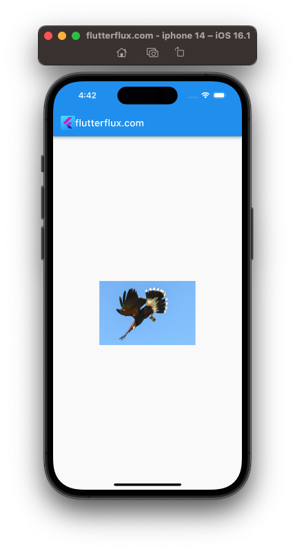
A 200-pixel SizedBox is created by this code. The SizedBox Image.network widget loads images from URLs. During picture loading, the loadingBuilder argument displays a CircularProgressIndicator widget. Until the image loads, the SizedBox holds it.
What is Container?
Flutter Container widget lets developers define widget sizes and positions. This widget is more adaptable than the SizedBox widget since developers can set a widget size, color, padding, margin, border, and more.
Developers use the Container widget to add visual components or group widget. This widget can set the width or height of other widget, although it is usually used for more intricate layouts where a fixed size is not enough.
Definition and basic usage
Container is a widget that creates a rectangle visual element with visual features like background color, border, padding, margin, and so on. Container widget can hold and position child widgets or be used alone. Here’s a Container widget with visual properties:
Container(
  width: 100,
  height: 100,
  color: Colors.blue,
  margin: EdgeInsets.all(10),
  padding: EdgeInsets.all(5),
  alignment: Alignment.center,
  child: Text('Hello'),
);
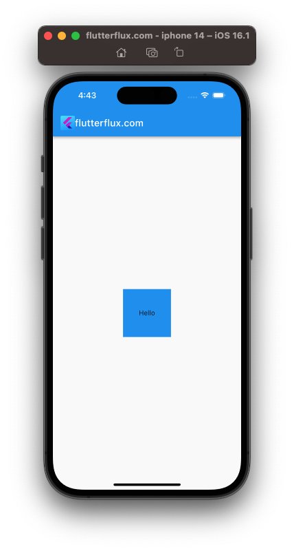
This code produces a Container with a blue background, 100 pixels wide and tall, 10 pixels margins and 5 pixels padding on all sides. Alignment centres the child widget in the container. Text widget with Hello are child widgets.
Containers can hold child widget. Container holding Text widget:
Container(
  padding: EdgeInsets.all(10),
  child: Text('Hello'),
);
This above code Container with 10-pixel padding on all edges. Text widget with Hello are child widget. Container padding surrounds Text widget.
The Container widget can hold and arrange child widgets to construct rectangular graphic elements with varied visual attributes.
When to use Container?
Flutter container widget is versatile and widely used. Use Container in these situations:
- Decorating a widget: A
Containerwidget can be used to decorate a widget with abackground color,border,margin, or padding. - Positioning a widget: Use a fixed-size
Containerand the alignment property to position a widget on the screen. - Creating a custom button: Wrapping a child widget in a
Containerwidget and adding aGestureDetectorto detect tap events creates a custom button. - Building a card layout:
Containerwidget may construct card layouts with background color,border, andpadding. - Creating a custom shape: You can create a custom shape by setting the
shapeproperty of aContainerto aShapeBorderobject. - Holding and positioning child widgets:
Containerholds and positions child widget.Containerchild widget can havepadding,margin, andalignment.
Container can be used for decorating, positioning, generating bespoke layouts, and creating custom forms.
Examples of using Container
Here are some examples of using Container widget in Flutter:
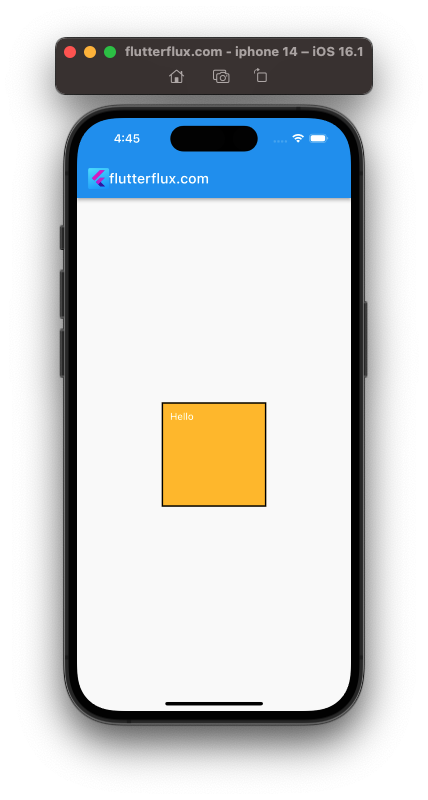
- Adding background color and border to a widget:
Container(
          height: 150,
          width: 150,
          child: Text('Hello', style: TextStyle(color: Colors.white)),
          padding: EdgeInsets.all(10),
          decoration: BoxDecoration(
            color: Colors.amber,
            border: Border.all(
              color: Colors.black,
              width: 2,
            ),
          ),
        )
- Custom button:
GestureDetector(
  onTap: () => print('Button tapped'),
  child: Container(
    padding: EdgeInsets.symmetric(horizontal: 16, vertical: 8),
    decoration: BoxDecoration(
      color: Colors.blue,
      borderRadius: BorderRadius.circular(8),
    ),
    child: Text('Click me', style: TextStyle(color: Colors.white)),
  ),
)

- Positioning a widget
Container:
Container(
  width: 200,
  height: 200,
  alignment: Alignment.center,
  child: Text('Hello'),
)
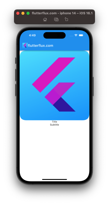
- Creating a card layout:
Container(
  decoration: BoxDecoration(
    color: Colors.white,
    borderRadius: BorderRadius.circular(8),
    boxShadow: [
      BoxShadow(
        color: Colors.grey.withOpacity(0.5),
        spreadRadius: 2,
        blurRadius: 4,
        offset: Offset(0, 2),
      ),
    ],
  ),
  child: Column(
    children: [
      Image.asset('assets/image.png'),
      Text('Title'),
      Text('Subtitle'),
    ],
  ),
)
- Creating a custom shape:
Container(
  width: 100,
  height: 100,
  decoration: BoxDecoration(
    shape: BoxShape.circle,
    color: Colors.blue,
  ),
  child: Icon(Icons.person, color: Colors.white),
)
Container allows develop custom widgets and layouts in Flutter apps.
Differences between SizedBox and Container
Flutter SizedBox and Container widget can both set child widget sizes and layouts, although they work differently.
- Size control:
SizedBoxcontrols the size of a widget by defining a defined width and height, whileContainercan also define a fixed size or automatically size itself to fit its child widget. - Child widget management:
Containerholds and positions child widgets, butSizedBoxdoes not. - Decoration:
Containerprovides more widget decoration options than SizedBox, including background color,border,padding,margin, and shape. - Performance:
SizedBoxis a simple widget that just defines a widget size, whileContainerhas more capabilities and functionality, which can make it significantly less performant.
Here are some common use cases for each widget:
Use SizedBox when:
- You want to define a fixed size for a widget.
- You need to add space between widget by using
SizedBoxwith a zero width or height.
Use Container when:
- You need to define a fixed size for a widget, but also want to add decoration or hold child widgets inside it.
- You want to apply decoration to a widget, such as a background color,
border,padding, or margin. - You need to hold and position child widget inside a widget.
Size constraints vs layout constraints
Size and layout limits can be applied to widget in Flutter. Flutter widget sizes and layouts are determined by these limitations.
Size constraints set a widget’s size, which might be fixed or variable. Size limitations include:
BoxConstraints.tightFor: imposes width and height limitations on the widget.BoxConstraints.loose: Allows the widget to be a variety of sizes.BoxConstraints.expand: Creates limitations that force the widget to fill the space.
Layout constraints put widgets within their parents. Layout restrictions:
EdgeInsets: Adds padding around the edges of a widget.Align: Positions a widget within its parent widget according to a specific alignment.Stack: Stacks widgets on top of each other.
Size constraints establish a widget size, whereas layout constraints position and lay it out within its parent widget.
Flutter projects use size and layout constraints to achieve a specific layout or design. A BoxConstraints widget can set a widget size, and an Align widget can position it within its parent widget.
Performance considerations
SizedBox is often faster than Container. Simpler widget have less code and are easier for Flutter to optimise.
However, Container rarely affects performance. sophisticated widget like Container only affect performance when several are rendered on the screen or when the widget tree is deep or sophisticated.
To optimize performance when using widgets like Container, there are a few things you can do:
- When possible, use constant widget. Flutter is better able to optimise code when using const widgets because they are already constructed.
- Reduce the depth of your widget if possible. Adding a new widget to the screen takes more time and resources to render.
- Use widgets like
ListView.builderorGridView.builderto lazily build and render only the widgets that are currently visible on the screen. - Avoid expensive build methods like network queries or extensive computations, which can impede widget tree rendering.
Follow these best practises and consider performance when creating Flutter apps to make them fast and responsive.
Conclusion
Both SizedBox and Container are useful widget in Flutter, but they serve different purposes. Understanding their differences and use cases will help you choose the right one for your needs and create more efficient and effective UI layouts. read too Top 10 Google Fonts in Flutter for Beautiful App Design


