Flutter timepicker is a widget that allows the user to select a specific time of day, typically using an interface that displays a clock face with hour and minute hands. The showTimePicker method in Flutter’s material.dart library provides a built-in time picker dialog that can be easily integrated into a Flutter app.
The initialTime and BuildContext are passed into the showTimePicker method, and it returns a Future<TimeOfDay> that resolves to the time the user selects. Flutter Timepicker Example dialog lets the user choose a time by dragging the hour and minute hands around the clock display or by typing in the desired time.
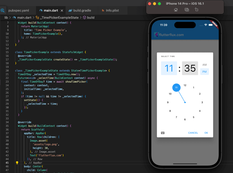
After the user makes a choice, the Future<TimeOfDay> resolves to the chosen time, which may subsequently be used to refresh the UI or carry out additional app-level actions. Flutter Timepicker Example is a simple and straightforward method of letting app users choose a time range.
Example of a Flutter Timepicker:
import 'package:flutter/material.dart';

class TimePickerExample extends StatefulWidget {
  @override
  _TimePickerExampleState createState() => _TimePickerExampleState();
}

class _TimePickerExampleState extends State<TimePickerExample> {
  TimeOfDay _selectedTime = TimeOfDay.now();

  Future<void> _selectTime(BuildContext context) async {
    final TimeOfDay? time = await showTimePicker(
      context: context,
      initialTime: _selectedTime,
    );
    if (time != null && time != _selectedTime) {
      setState(() {
        _selectedTime = time;
      });
    }
  }

  @override
  Widget build(BuildContext context) {
    return Scaffold(
      appBar: AppBar(
        title: Text('Time Picker Example'),
      ),
      body: Center(
        child: Column(
          mainAxisAlignment: MainAxisAlignment.center,
          children: <Widget>[
            Text(
              'Selected Time: ${_selectedTime.format(context)}',
              style: TextStyle(fontSize: 20),
            ),
            SizedBox(height: 20),
            ElevatedButton(
              onPressed: () => _selectTime(context),
              child: Text('Select Time'),
            ),
          ],
        ),
      ),
    );
  }
}
Flutter TimePicker Example is a stateful widget that stores the currently selected time in a TimeOfDay variable named _selectedTime. We also provide a method called _selectTime, which displays the time picker dialog and updates the _selectedTime variable when the user selects a new time. During construction, we show the currently chosen time and a button that, when clicked, invokes the _selectTime method. Whenever the user chooses a different time, the setState method is invoked to reflect the new time in the user interface.
Complete example of using the showTimePicker method in Flutter Timepicker dialog:
import 'package:flutter/material.dart';

void main() => runApp(MyApp());

class MyApp extends StatelessWidget {
  @override
  Widget build(BuildContext context) {
    return MaterialApp(
      title: 'Time Picker Example',
      home: TimePickerExample(),
    );
  }
}

class TimePickerExample extends StatefulWidget {
  @override
  _TimePickerExampleState createState() => _TimePickerExampleState();
}

class _TimePickerExampleState extends State<TimePickerExample> {
  TimeOfDay _selectedTime = TimeOfDay.now();

  Future<void> _selectTime(BuildContext context) async {
    final TimeOfDay? time = await showTimePicker(
      context: context,
      initialTime: _selectedTime,
    );
    if (time != null && time != _selectedTime) {
      setState(() {
        _selectedTime = time;
      });
    }
  }

  @override
  Widget build(BuildContext context) {
    return Scaffold(
      appBar: AppBar(
        title: Text('Time Picker Example'),
      ),
      body: Center(
        child: Column(
          mainAxisAlignment: MainAxisAlignment.center,
          children: <Widget>[
            Text(
              'Selected Time: ${_selectedTime.format(context)}',
              style: TextStyle(fontSize: 20),
            ),
            SizedBox(height: 20),
            ElevatedButton(
              onPressed: () => _selectTime(context),
              child: Text('Select Time'),
            ),
          ],
        ),
      ),
    );
  }
}
In this example, we have a Flutter TimePicker Example widget that displays the currently selected time and a button to launch the flutter timepicker dialog. The _selectTime method launches the time picker dialog using the showTimePicker method, passing in the current BuildContext and the _selectedTime value as the initial time. When the user selects a new time, the _selectTime method updates the _selectedTime value using the setState method, which triggers a rebuild of the UI. The selected time is then displayed in the UI using a Text widget. This example demonstrates how easy it is to create a Flutter Timepicker using the showTimePicker method, and how to handle the selected time using state management.
Custom Flutter Timepicker
To create a custom Flutter Timepicker, you can use the CustomPainter class to draw the clock face and hands, and then use gesture detectors to handle user interactions with the clock.

Example of a custom time picker widget in Flutter:
import 'package:flutter/material.dart';
import 'dart:math' as math;

class CustomTimePicker extends StatefulWidget {
  final Function(TimeOfDay) onTimeSelected;

  CustomTimePicker({required this.onTimeSelected});

  @override
  _CustomTimePickerState createState() => _CustomTimePickerState();
}

class _CustomTimePickerState extends State<CustomTimePicker> {
  late double _angle;
  late double _radius;
  late Offset _center;

  @override
  void initState() {
    super.initState();
    _angle = -math.pi / 2;
    _radius = 100.0;
    _center = Offset(150.0, 150.0);
  }

  @override
  Widget build(BuildContext context) {
    return GestureDetector(
      onPanDown: _onPanDown,
      onPanUpdate: _onPanUpdate,
      child: CustomPaint(
        painter: ClockPainter(_angle, _radius, _center),
        child: Container(),
      ),
    );
  }

  void _onPanDown(DragDownDetails details) {
    _updateAngle(details.localPosition);
  }

  void _onPanUpdate(DragUpdateDetails details) {
    _updateAngle(details.localPosition);
  }

  void _updateAngle(Offset position) {
    final dx = position.dx - _center.dx;
    final dy = position.dy - _center.dy;
    final angle = math.atan2(dy, dx);
    setState(() {
      _angle = angle;
    });
    widget.onTimeSelected(_timeFromAngle(angle));
  }

  TimeOfDay _timeFromAngle(double angle) {
    final hours = (angle / (2 * math.pi) * 12) % 12;
    final minutes = ((angle / (2 * math.pi) * 720) % 60).round();
    return TimeOfDay(hour: hours.toInt(), minute: minutes);
  }
}

class ClockPainter extends CustomPainter {
  final double angle;
  final double radius;
  final Offset center;

  ClockPainter(this.angle, this.radius, this.center);

  @override
  void paint(Canvas canvas, Size size) {
    final paint = Paint()
      ..color = Colors.black
      ..strokeCap = StrokeCap.round
      ..strokeWidth = 5.0;

    final path = Path()
      ..moveTo(center.dx, center.dy)
      ..lineTo(
        center.dx + radius * math.cos(angle),
        center.dy + radius * math.sin(angle),
      );

    canvas.drawCircle(center, radius, paint);
    canvas.drawPath(path, paint);
  }

  @override
  bool shouldRepaint(CustomPainter oldDelegate) => true;
}
Here, we have a CustomTimePicker that draws the clock face and hour hand using a ClockPainter custom painter.
We keep track of the hour hand’s current angle, the clock face’s radius, and the clock’s center in the _angle, _radius, and _center variables, respectively.
Users can interact with the clock by using the onPanDown and onPanUpdate gesture detectors. The _updateAngle method is invoked when the user taps or drags the clock face to adjust the angle of the hour hand.
With the onTimeSelected callback, the parent widget receives a TimeOfDay object derived from the current angle of the hour hand through the _timeFromAngle method.
This example shows how to utilize custom painting, gesture detection, and callbacks in Flutter to make a custom Flutter Timepicker that reports the selected time to its parent widget.
Complete code example of a custom Flutter Timepicker widget:
import 'package:flutter/material.dart';
import 'dart:math' as math;

class CustomTimePicker extends StatefulWidget {
  final Function(TimeOfDay) onTimeSelected;

  CustomTimePicker({required this.onTimeSelected});

  @override
  _CustomTimePickerState createState() => _CustomTimePickerState();
}

class _CustomTimePickerState extends State<CustomTimePicker> {
  late double _angle;
  late double _radius;
  late Offset _center;

  @override
  void initState() {
    super.initState();
    _angle = -math.pi / 2;
    _radius = 100.0;
    _center = Offset(150.0, 150.0);
  }

  @override
  Widget build(BuildContext context) {
    return GestureDetector(
      onPanDown: _onPanDown,
      onPanUpdate: _onPanUpdate,
      child: CustomPaint(
        painter: ClockPainter(_angle, _radius, _center),
        child: Container(),
      ),
    );
  }

  void _onPanDown(DragDownDetails details) {
    _updateAngle(details.localPosition);
  }

  void _onPanUpdate(DragUpdateDetails details) {
    _updateAngle(details.localPosition);
  }

  void _updateAngle(Offset position) {
    final dx = position.dx - _center.dx;
    final dy = position.dy - _center.dy;
    final angle = math.atan2(dy, dx);
    setState(() {
      _angle = angle;
    });
    widget.onTimeSelected(_timeFromAngle(angle));
  }

  TimeOfDay _timeFromAngle(double angle) {
    final hours = (angle / (2 * math.pi) * 12) % 12;
    final minutes = ((angle / (2 * math.pi) * 720) % 60).round();
    return TimeOfDay(hour: hours.toInt(), minute: minutes);
  }
}

class ClockPainter extends CustomPainter {
  final double angle;
  final double radius;
  final Offset center;

  ClockPainter(this.angle, this.radius, this.center);

  @override
  void paint(Canvas canvas, Size size) {
    final paint = Paint()
      ..color = Colors.black
      ..strokeCap = StrokeCap.round
      ..strokeWidth = 5.0;

    final path = Path()
      ..moveTo(center.dx, center.dy)
      ..lineTo(
        center.dx + radius * math.cos(angle),
        center.dy + radius * math.sin(angle),
      );

    canvas.drawCircle(center, radius, paint);
    canvas.drawPath(path, paint);
  }

  @override
  bool shouldRepaint(CustomPainter oldDelegate) => true;
}

class CustomTimePickerExample extends StatefulWidget {
  @override
  _CustomTimePickerExampleState createState() =>
      _CustomTimePickerExampleState();
}

class _CustomTimePickerExampleState extends State<CustomTimePickerExample> {
  TimeOfDay _selectedTime = TimeOfDay.now();

  @override
  Widget build(BuildContext context) {
    return Scaffold(
      appBar: AppBar(
        title: Text('Custom Time Picker Example'),
      ),
      body: Center(
        child: Column(
          mainAxisAlignment: MainAxisAlignment.center,
          children: [
            CustomTimePicker(
              onTimeSelected: (time) {
                setState(() {
                  _selectedTime = time;
                });
              },
            ),
            SizedBox(height: 20),
            Text(
              'Selected Time: ${_selectedTime.hour}:${_selectedTime.minute}',
              style: TextStyle(fontSize: 20),
            ),
          ],
        ),
      ),
    );
  }
}
Here we have a CustomTimePicker widget with an integrated ClockPainter custom painter for displaying the time and hour hand.
The current angle of the hour hand, the radius of the clock face, and the center point of the clock face are all kept in the _angle, _radius, and _center variables, respectively.
In order to process user input regarding the timepiece, we employ the onPanDown and onPanUpdate gesture detectors. The user’s finger location is used to change the angle of the hour hand via the _updateAngle method, which is called whenever the user taps or drags the clock.
The onTimeSelected callback notifies the parent widget of the time that was selected by using the TimeOfDay object generated by the _timeFromAngle function.
One such example is the CustomTimePickerExample widget, which merely shows the user-selected time in the interface. Each time a user chooses a new time using the custom time picker, the setState function is called to change the selected time and rebuild the user interface.
By the use of custom painting, gesture detection, and callbacks, this example shows how to build a custom time picker in Flutter and pass the selected time to the parent widget.
Conclusion
A user-friendly TimePicker widget is included in Flutter. Flutter TimePicker widgets can be customized to meet application needs. Developers can select a 12-hour or 24-hour TimePicker format and define its text color, backdrop color, and font size.

