ActionChip in Flutter, a material design component in Flutter, is a small, widget that performs an action. Flutter applications use it to filter or trigger actions.
ActionChip are rounded rectangular buttons with labels and icons. ActionChips open new screens or filter content when tapped.
ActionChips can display badges and tooltips to give users more context.
Constructors ActionChip Flutter
ActionChip in Flutter is a material design widget that represents a button with a label and an action associated with it. Here are the constructors of ActionChip:
ActionChip({Key? key, required Widget label, VoidCallback? onPressed, ShapeBorder? shape, EdgeInsetsGeometry? padding, Color? backgroundColor, Color? foregroundColor, double? elevation, double? pressElevation, MaterialTapTargetSize? materialTapTargetSize})
This constructor creates a parameterized ActionChip in Flutter widget. Label is required and displays the chip label. Tapping the chip activates the onPressed callback. Shape is an optional parameter that specifies chip shape. The padding parameter allows chip padding. BackgroundColor sets the chip’s background color. Set the chip’s text color with foregroundColor. The materialTapTargetSize parameter sets the tap area target size.
ActionChip.icon({Key? key, required Widget icon, required Widget label, VoidCallback? onPressed, ShapeBorder? shape, EdgeInsetsGeometry? padding, Color? backgroundColor, Color? foregroundColor, double? elevation, double? pressElevation, MaterialTapTargetSize? materialTapTargetSize})
Constructors produce icon and label ActionChip widgets. Essential icon chip image. Same parameters for the new constructor.
How to use ActionChip in Flutter
Here’s how you can integrate ActionChip into your Flutter app:
- Import the Material packages in Dart file:
import 'package:flutter/material.dart';
- Make the ActionChip in Flutter widget and set its parameters. A labeled and icon-equipped ActionChip looks like this one:
ActionChip(
  label: Text('Action'),
  icon: Icon(Icons.play_arrow),
  onPressed: () {
    // Perform some action when the chip is pressed
  },
),
- ActionChip attributes like backgroundColor, labelStyle, and shape can be used to alter the chip’s visual style.
ActionChip(
  label: Text('Action'),
  icon: Icon(Icons.play_arrow),
  backgroundColor: Colors.blue,
  labelStyle: TextStyle(
    color: Colors.white,
    fontWeight: FontWeight.bold,
  ),
  shape: RoundedRectangleBorder(
    borderRadius: BorderRadius.circular(10),
  ),
  onPressed: () {
    // Perform some action when the chip is pressed
  },
),
- ActionChip avatar and tooltip can display information:
ActionChip(
  label: Text('Action'),
  avatar: Icon(Icons.info),
  tooltip: 'This is an action chip',
  onPressed: () {
    // Perform some action when the chip is pressed
  },
),
- At last, the ActionChip in Flutter widget can be placed wherever you like in your Flutter design:
Scaffold(
  body: Center(
    child: ActionChip(
      label: Text('Action'),
      icon: Icon(Icons.play_arrow),
      onPressed: () {
        // Perform some action when the chip is pressed
      },
    ),
  ),
);
The fundamentals of integrating ActionChip into a Flutter app are as follows. You can create unique buttons and filters for your app by modifying its attributes and visual design.
Full Code
import 'package:flutter/material.dart';

void main() => runApp(MyApp());

class MyApp extends StatelessWidget {
  @override
  Widget build(BuildContext context) {
    return MaterialApp(
      title: 'ActionChip Demo',
      home: Scaffold(
        appBar: AppBar(
          title: Row(children: [
            Image.asset(
              'assets/logo.png',
              height: 30,
            ),
            Text('flutterflux.com')
          ]),
        ),
        body: Center(
          child: Column(
            mainAxisAlignment: MainAxisAlignment.center,
            children: <Widget>[
              ActionChip(
                label: Text('Action 1'),
                onPressed: () {
                  // Perform some action when the chip is pressed
                  print('Action 1 pressed');
                },
              ),
              SizedBox(height: 20),
              ActionChip(
                label: Text('Action 2'),
                avatar: Icon(Icons.info),
                tooltip: 'This is an action chip',
                onPressed: () {
                  // Perform some action when the chip is pressed
                  print('Action 2 pressed');
                },
              ),
              SizedBox(height: 20),
              ActionChip(
                label: Text('Action 3'),
                backgroundColor: Colors.red,
                labelStyle: TextStyle(
                  color: Colors.white,
                  fontWeight: FontWeight.bold,
                ),
                shape: RoundedRectangleBorder(
                  borderRadius: BorderRadius.circular(10),
                ),
                onPressed: () {
                  // Perform some action when the chip is pressed
                  print('Action 3 pressed');
                },
              ),
            ],
          ),
        ),
      ),
    );
  }
}
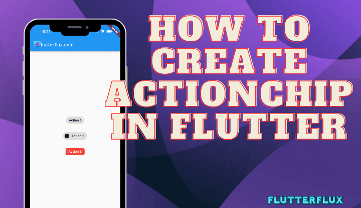
Output
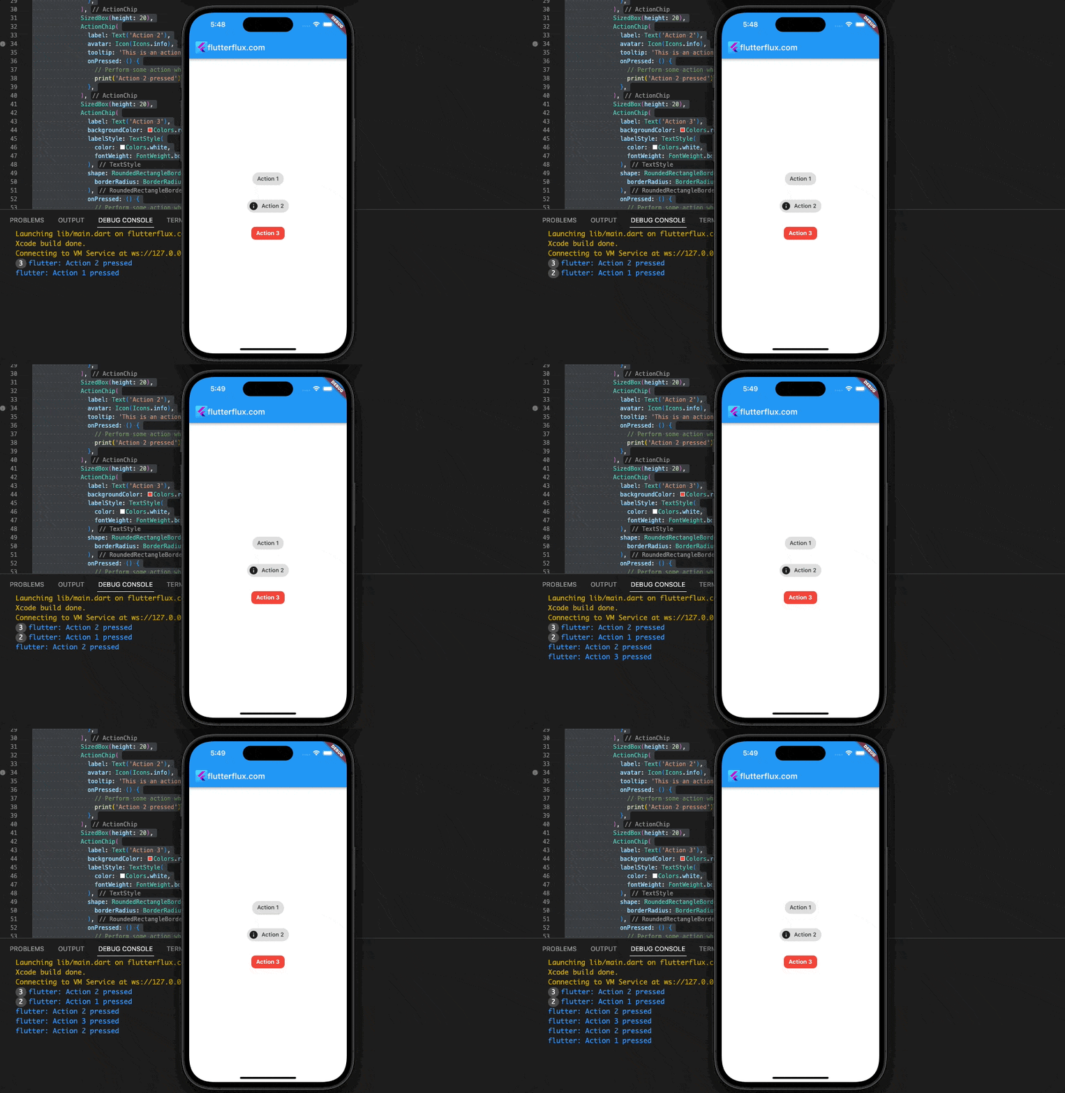
Conclusion
ActionChip in Flutter is a helpful widget that lets you make a button with an icon and a label to launch an action. It can be used to make more engaging interfaces for users and improve their entire experience. ActionChips are flexible enough to be adapted to your app’s aesthetic, and they play well with other Flutter widgets. You can use them to filter information, narrow down your choices, and set off various events. ActionChip’s flexibility and simplicity make it a valuable resource for any Flutter programmer. read too How to Create ChoiceChip in Flutter

