
How to Create GridView in Flutter – Hello everyone, welcome to Flutterflux. now we will discuss GridView in Flutter and how to implement GridView and make it looks good.
You can adjust GridView grid layout. The number of columns, cell size, and cell spacing are customizable. You can also align and extend things within each cell.
Here example of a basic Custom GridView in Flutter
import 'package:flutter/material.dart';

void main() {
  runApp(MaterialApp(
    home: HomePage(),
  ));
}

class HomePage extends StatelessWidget {
  @override
  Widget build(BuildContext context) {
    return Scaffold(
        appBar: AppBar(
          title: Row(children: [
            Image.asset(
              'assets/logo.png',
              height: 30,
            ),
            Text('flutterflux.com')
          ]),
        ),
        body: GridView.count(
            crossAxisCount: 2, // number of columns
            mainAxisSpacing: 2,
            crossAxisSpacing: 2,
            children: List.generate(20, (index) {
              return Container(
                  color: Colors.deepPurple,
                  child: Center(
                    child: Text(
                      'Item $index',
                      style: Theme.of(context).textTheme.headlineSmall,
                    ),
                  ));
            })));
  }
}
Here, we set the crossAxisCount of the GridView in Flutter widget to 2, so that two rows of data will be seen at once. With the help of the List.generate method, we construct a list of 20 items, each of which is a Text widget with a distinct label.
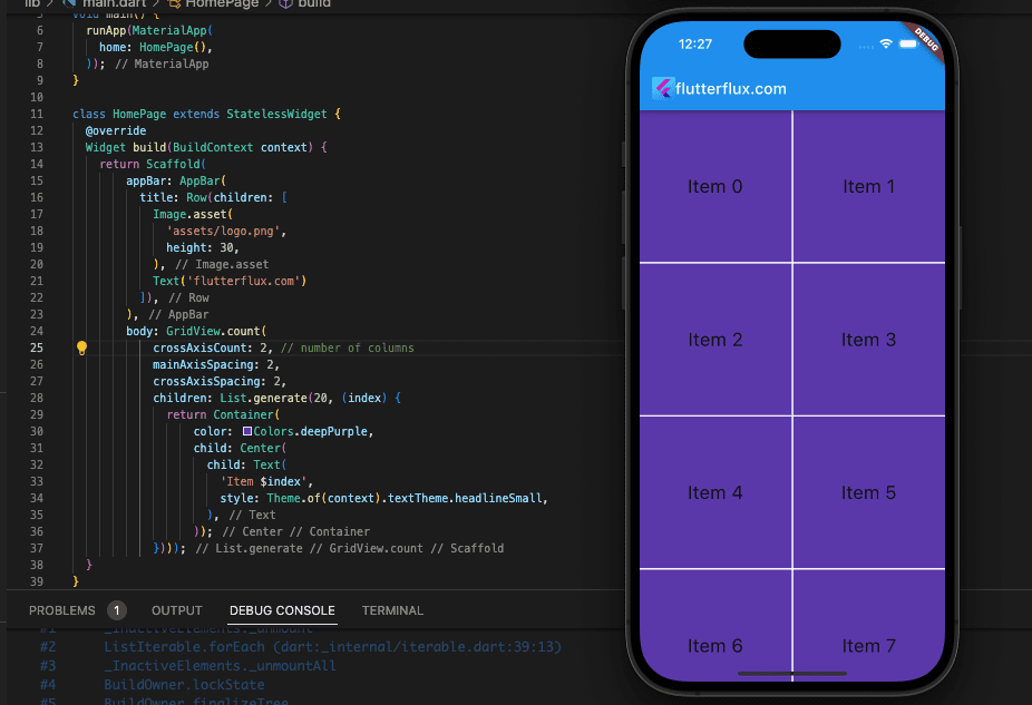
Two cells each row yields a total of 20 cells in the resultant grid. A Text widget, labelled “Item X,” will be placed in each cell, where X is the cell’s index number.
Custom GridView with Border
Wrapping a Flutter GridView in a Container widget and then decorating that widget with a BoxDecoration yields the desired effect of giving the GridView a border. The following is an example of this:
import 'package:flutter/material.dart';

void main() {
  runApp(MaterialApp(
    home: HomePage(),
  ));
}

class HomePage extends StatelessWidget {
  @override
  Widget build(BuildContext context) {
    return Scaffold(
        appBar: AppBar(
          title: Row(children: [
            Image.asset(
              'assets/logo.png',
              height: 30,
            ),
            Text('flutterflux.com')
          ]),
        ),
        body: GridView.count(
            crossAxisCount: 2, // number of columns
            mainAxisSpacing: 2,
            crossAxisSpacing: 2,
            children: List.generate(20, (index) {
              return Container(
                  decoration: BoxDecoration(
                    color: Colors.deepPurple,
                    border: Border.all(color: Colors.red, width: 2),
                  ),
                  child: Center(
                    child: Text(
                      'Item $index',
                      style: Theme.of(context).textTheme.headlineSmall,
                    ),
                  ));
            })));
  }
}
This example wraps the GridView in a Container with a BoxDecoration. The decoration’s border is a red Border object. This will outline the GridView.
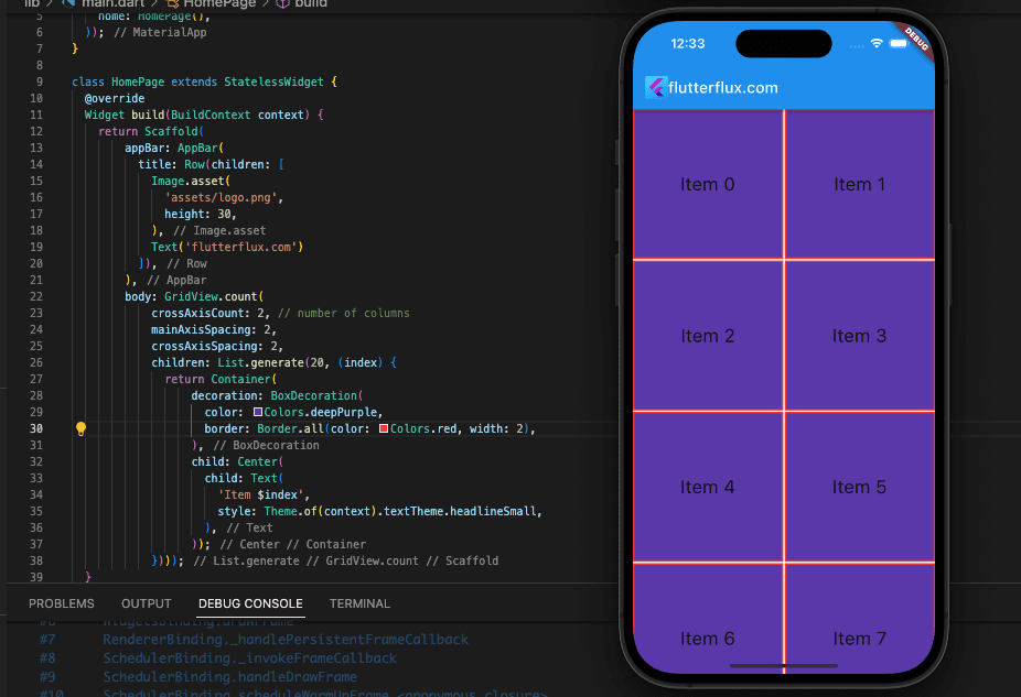
The Border object’s BorderSide properties, such as width and style, allow further modify the border. Other Container decorations include background colors and gradients.
Flutter staggered GridView
if you want to create GridView in Flutter with random height, we can use package Flutter_staggered_grid_view
import 'package:flutter/material.dart';
import 'package:flutter_staggered_grid_view/flutter_staggered_grid_view.dart';

void main() {
  runApp(MaterialApp(
    home: HomePage(),
  ));
}

class HomePage extends StatelessWidget {
  final List items = List.generate(100, (index) => 'Item $index');
  @override
  Widget build(BuildContext context) {
    return Scaffold(
      appBar: AppBar(
        title: Row(children: [
          Image.asset(
            'assets/logo.png',
            height: 30,
          ),
          Text('flutterflux.com')
        ]),
      ),
      body: GridView.custom(
        gridDelegate: SliverWovenGridDelegate.count(
          crossAxisCount: 2,
          mainAxisSpacing: 3,
          crossAxisSpacing: 3,
          pattern: [
            WovenGridTile(1),
            WovenGridTile(
              5 / 5,
              crossAxisRatio: 0.9,
              alignment: AlignmentDirectional.centerEnd,
            ),
          ],
        ),
        childrenDelegate: SliverChildBuilderDelegate(
          (context, index) => Container(
            color: Colors.deepPurple[200],
            child: Center(
              child: Text(
                items[index],
                style: Theme.of(context).textTheme.headlineSmall,
              ),
            ),
          ),
        ),
      ),
    );
  }
}
Conclusion
The GridView widget makes it simple to construct a responsive layout that reformats itself to fit screens of varying sizes and orientations. In addition, you can process clicks and taps on certain grid objects and then respond in accordance with the user’s instructions.


