Show hide widget in Flutter using Visibility and Opacity Flutter – One of Flutter widget, “Visibility,” determines whether or not its offspring are visible. It accepts a boolean value as an argument to toggle the visibility of the child widget.
child widget can be given its own visible state using the Visibility widget. Parameterized with a boolean value, it controls the visibility of its child widget.
The visible property is used to determine whether Show hide widget in Flutter.
The child widget is shown if the visible property is set to true, and it is hidden otherwise.
You can control whether the child widget state is saved when it’s hidden by setting the maintainState attribute. When a child widget is hidden, its state is either retained (if maintainState is true) or cleared (if maintainState is false) depending on the setting.
If the child widget animation is to be kept when it is hidden, the maintainAnimation attribute can be utilized to do so. If maintainAnimation is set to true, the child widget animation will play through while it is hidden, and if it is set to false, the animation will stop.
By setting the maintainSize attribute, you can control if the child widget size is preserved even after it has been hidden. If the maintainSize property is set to true, the child widget size is kept the same even when it is hidden; otherwise, the size is reduced to zero.
Opacity is a widget in Flutter that controls the Show Hide Widget in Flutter.
It takes a double value between 0.0 and 1.0 as a parameter, which determines the opacity level of the child widget.
The Opacity widget’s solitary property, opacity, sets the child widget opacity. The child widget is transparent at 0.0 and opaque at 1.0. The child widget is partially translucent at 0.0–1.0.
example of how to use the Opacity widget to make a Container widget partially transparent:
Opacity(
 opacity: 0.5,
 child: Container(
   height: 100,
   width: 100,
   color: Colors.blue,
  ),
)
In this example, the Container widget is wrapped inside an Opacity widget with an opacity value of 0.5. This makes the Container widget partially transparent, with a transparency level of 50%.
The Opacity widget is useful when you want to make a widget partially transparent without hiding it completely. It’s versatile enough to be utilized for a wide range of visual effects, from translucent overlays to widgets that fade in and out.
To Show hide widget in Flutter, you can use the Visibility widget.
The Visibility widget controls the visibility of its child widget based on a boolean value. The child widget is displayed if the boolean value is true, and hidden otherwise.
example of how to use the Visibility widget to Show hide widget in Flutter based on a boolean value:
bool isVisible = true;

Visibility(
  visible: isVisible,
  child: Container(
    height: 100,
    width: 100,
    color: Colors.blue,
  ),
)
In this example, the Container widget will be visible because the isVisible variable is set to true. If you change the value of isVisible to false, the Container widget will be hidden.
You can also use the Opacity widget to make a widget transparent instead of hiding it completely. The Opacity widget takes a double value between 0.0 and 1.0 to control the opacity level of its child widget.
example of how to use the Opacity widget to make a widget transparent:
double opacityLevel = 0.5;

Opacity(
  opacity: opacityLevel,
  child: Container(
    height: 100,
    width: 100,
    color: Colors.blue,
  ),
)
this example, the Container widget will be partially transparent because the opacityLevel variable is set to 0.5. If you change the value of opacityLevel to 1.0, the Container widget will be fully opaque.
Example use of Visibility and Opacity to Show hide widget in Flutter:
import 'package:flutter/material.dart';

classVisibilityAndOpacityDemo extendsStatefulWidget {
  @override
  _VisibilityAndOpacityDemoState createState() =>
      _VisibilityAndOpacityDemoState();
}

class_VisibilityAndOpacityDemoState extendsState<VisibilityAndOpacityDemo> {
  bool isVisible = true;
  double opacityLevel = 1.0;

  @override
  Widget build(BuildContext context) {
    return Scaffold(
      appBar: AppBar(
        title: Text('Visibility and Opacity Demo'),
      ),
      body: Center(
        child: Column(
          mainAxisAlignment: MainAxisAlignment.center,
          children: [
            Visibility(
              visible: isVisible,
              maintainState: true,
              maintainAnimation: true,
              maintainSize: true,
              child: Container(
                height: 100,
                width: 100,
                color: Colors.blue,
                child: Center(
                  child: Text(
                    'Visible Widget',
                    style: TextStyle(color: Colors.white),
                  ),
                ),
              ),
            ),
            SizedBox(height: 20),
            Opacity(
              opacity: opacityLevel,
              child: Container(
                height: 100,
                width: 100,
                color: Colors.red,
                child: Center(
                  child: Text(
                    'Opaque Widget',
                    style: TextStyle(color: Colors.white),
                  ),
                ),
              ),
            ),
            SizedBox(height: 20),
            RaisedButton(
              onPressed: () {
                setState(() {
                  isVisible = !isVisible;
                  opacityLevel = opacityLevel == 1.0 ? 0.5 : 1.0;
                });
              },
              child: Text('Toggle Visibility and Opacity'),
            ),
          ],
        ),
      ),
    );
  }
}
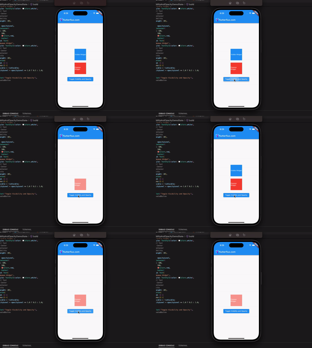
Both the Visibility and Opacity widgets are enclosing other widgets in this example. Blue Container widgets labeled “Visible Widget” and red Container widgets labeled “Opaque Widget” are under the purview of the respective Visibility and Opacity widgets, respectively.
By toggling the isVisible and opacityLevel variables, the visibility and opacity of the widgets are modified when the “Toggle Visibility and Opacity” button is clicked.

