Working with ListTile Flutter – hi guys, welcome back to my blog, now we will learn about ListTile in flutter. before practice it’s good for us to know what a listtile is and how to use it.
ListTile, a pre-built widget in Flutter, creates a single row of data for ListViews and DataTables. It’s made of Padding, Row, Column, and InkWell widgets.
ListTile widgets provide for succinct, scannable information display. A title, subtitle, and trailing widget are optional.
ListTile variations
The ListTile widget is one of the most often used and flexible widgets in Flutter, and it is used to display data in a list. Flutter ListTile can typically be customized as follows:
- Basic ListTile – The bare minimum for a ListTile is an image or icon at the top followed by text for the title and subtitle.
- Dense ListTile – The dense attribute of ListTile reduces the vertical padding, resulting in a more space-efficient representation of the data.
- ListTile with trailing widget – Widget appended to the right side of the ListTile via its trailing attribute. This is helpful when showing supplementary data like a counter or a progress bar.
- ListTile with custom leading and trailing widgets – Widgets can be added at the beginning and end of a ListTile via the leading and trailing properties. It’s common practice to use a Checkbox as the first widget in a sequence to denote selection, and a PopupMenuButton as the last widget in a sequence to present a context menu.
- ListTile with onTap behavior – Use the onTap property to add a tap callback to the ListTile, allowing users to interact with the list item by tapping on it.
- Selected ListTile – When implementing a list of selectable items, the chosen property can be used to highlight the ListTile as selected.
- ListTile with custom theme – ListTile with a personalized theme enables you to alter the layout, fonts, and colors of the ListTile and its child widgets with a single widget.
- ListTile with a unique shape – A ListTile can have a unique shape, such a rounded rectangle, by applying a ShapeDecoration.
These are but a few of the many possible customizations of ListTile in Flutter. Flutter adaptability and customization make the potential applications practically limitless.
A simple ListTile in Flutter widget looks like this:
Basic ListTile in Flutter
ListTile(
  leading: Icon(Icons.person),
  title: Text('John Doe'),
  subtitle: Text('[email protected]'),
  trailing: Icon(Icons.arrow_forward),
  onTap: () {
    // Do something when the user taps the ListTile
  },
)
The leading widget, title widget, subtitle widget, and tail widget are all icons in the example above. When a user taps on a ListTile, the action defined by the onTap property will be carried out.
ListTile attributes allow you to adjust its appearance and behavior to meet your needs. Popular ListTile widget settings include dense, contentPadding, selected, enabled, selectedTileColor, and shape.
Complete code ListTile in Flutter is seen here:
import 'package:flutter/material.dart';

void main() {
  runApp(MaterialApp(
    home: FlutterFluxApp(),
  ));
}

class FlutterFluxApp extends StatefulWidget {
  const FlutterFluxApp({super.key});

  @override
  State createState() => _FlutterFluxAppState();
}

class _FlutterFluxAppState extends State {
  DateTime? selectedDate;
  @override
  Widget build(BuildContext context) {
    return Scaffold(
        appBar: AppBar(
          title: Row(children: [
            Image.asset(
              'assets/logo.png',
              height: 30,
            ),
            Text('flutterflux.com')
          ]),
        ),
        body: ListTile(
          contentPadding:
              EdgeInsets.symmetric(horizontal: 20.0, vertical: 10.0),
          leading: CircleAvatar(
            radius: 30.0,
            backgroundImage: NetworkImage('https://picsum.photos/200'),
          ),
          title: Text(
            'Flutter ListTile Example',
            style: TextStyle(
              fontSize: 18.0,
              fontWeight: FontWeight.bold,
            ),
          ),
          subtitle: Text(
            'This is an example of ListTile subtitle.',
            style: TextStyle(
              fontSize: 16.0,
              color: Colors.grey[600],
            ),
          ),
          trailing: Icon(
            Icons.arrow_forward_ios,
            size: 20.0,
            color: Colors.grey[500],
          ),
          onTap: () {
            // Do something when the user taps the ListTile
          },
        ));
  }
}
To illustrate, we’ve inserted a CircleAvatar as the primary widget to showcase a picture, and a Column widget below it to provide context. We also made the title bigger and bolder to fit your preferences. ListTile in Flutter content padding is controlled by its contentPadding parameter, and the trailing widget is a smaller, gray-colored Icon.
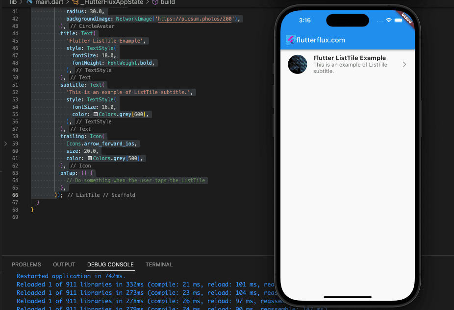
This is only one of many possible modifications to a ListTile in Flutter.
ListTile in Flutter with ListVIew.builder
ListTile and ListView.builder in Flutter may generate a scrollable list of tiles using data. ListView.builder builds a scrollable, linear array of widgets dynamically built from a list.
ListView.builder requires a list of data to display as ListTile in Flutter widget. The ListView.builder widget receives this list and a builder function that builds a ListTile for each item.
Here is a sample of combining ListView.builder and ListTile:
import 'package:flutter/material.dart';

void main() {
  runApp(MaterialApp(
    home: FlutterFluxApp(),
  ));
}

class FlutterFluxApp extends StatefulWidget {
  const FlutterFluxApp({super.key});

  @override
  State createState() => _FlutterFluxAppState();
}

class _FlutterFluxAppState extends State {
  List<Map<String, String>> myList = [
    {
      "leading": "https://picsum.photos/200",
      "title": "Item 1",
      "subtitle": "This is item 1"
    },
    {
      "leading": "https://picsum.photos/200",
      "title": "Item 2",
      "subtitle": "This is item 2"
    },
    {
      "leading": "https://picsum.photos/200",
      "title": "Item 3",
      "subtitle": "This is item 3"
    },
    {
      "leading": "https://picsum.photos/200",
      "title": "Item 4",
      "subtitle": "This is item 4"
    },
    {
      "leading": "https://picsum.photos/200",
      "title": "Item 5",
      "subtitle": "This is item 5"
    },
  ];
  DateTime? selectedDate;
  @override
  Widget build(BuildContext context) {
    return Scaffold(
        appBar: AppBar(
          title: Row(children: [
            Image.asset(
              'assets/logo.png',
              height: 30,
            ),
            Text('flutterflux.com')
          ]),
        ),
        body: ListView.builder(
          itemCount: myList.length,
          itemBuilder: (BuildContext context, int index) {
            return ListTile(
              leading: CircleAvatar(
                radius: 30.0,
                backgroundImage: NetworkImage(myList[index]['leading']!),
              ),
              title: Text(myList[index]['title']!),
              subtitle: Text(myList[index]['subtitle']!),
              onTap: () {
                // Do something when the user taps the ListTile
              },
            );
          },
        ));
  }
}
Here, we create a collection called myList that contains Map objects with a leading, title and subtitle key. Thereafter, we use ListView.builder to create a ListTile widget for each myList item. ItemBuilder creates a ListTile at each index in myList, with itemCount equal to the list length.
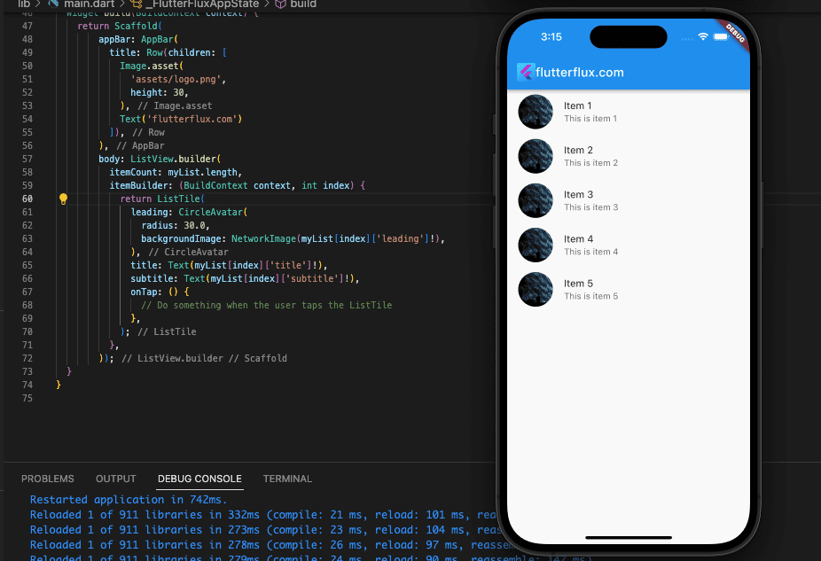
ListView.builder and ListTile make it simple to generate dynamic scrollable lists that present data clearly and concisely.
Custom ListTile in Flutter using ListTileTheme
Here’s how you may use ListTileTheme to give a ListTile a unique look:
ListTileTheme(
  dense: true,
  iconColor: Colors.blue,
  textColor: Colors.grey[700],
  tileColor: Colors.grey[200],
  selectedTileColor: Colors.blue[200],
  selectedColor: Colors.blue,
  child: ListTile(
    leading: Icon(Icons.person),
    title: Text('John Doe'),
    subtitle: Text('[email protected]'),
    trailing: Icon(Icons.arrow_forward_ios),
    onTap: () {
      // Do something when the user taps the ListTile
    },
  ),
);
Here, a ListTile is styled with a custom theme using ListTileTheme. To lessen the space between the ListTile in Flutter components, we’ve set the dense value to true. We also made blue the iconColor, grey the textColor, light the tileColor, and blue the selectedColor.
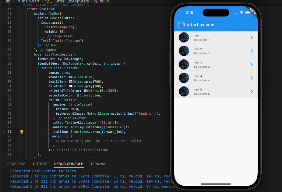
A ListTile widget is featured inside of ListTileTheme, complete with a title, subtitle, and tail icon. We also set up a callback, called onTap, to be executed when the user taps a ListTile in Flutter.
ListTileTheme allows us to give all ListTile widgets in our app (or just a subset of them) a unified look. This makes it simple to implement and keep our app’s visual identity constant.
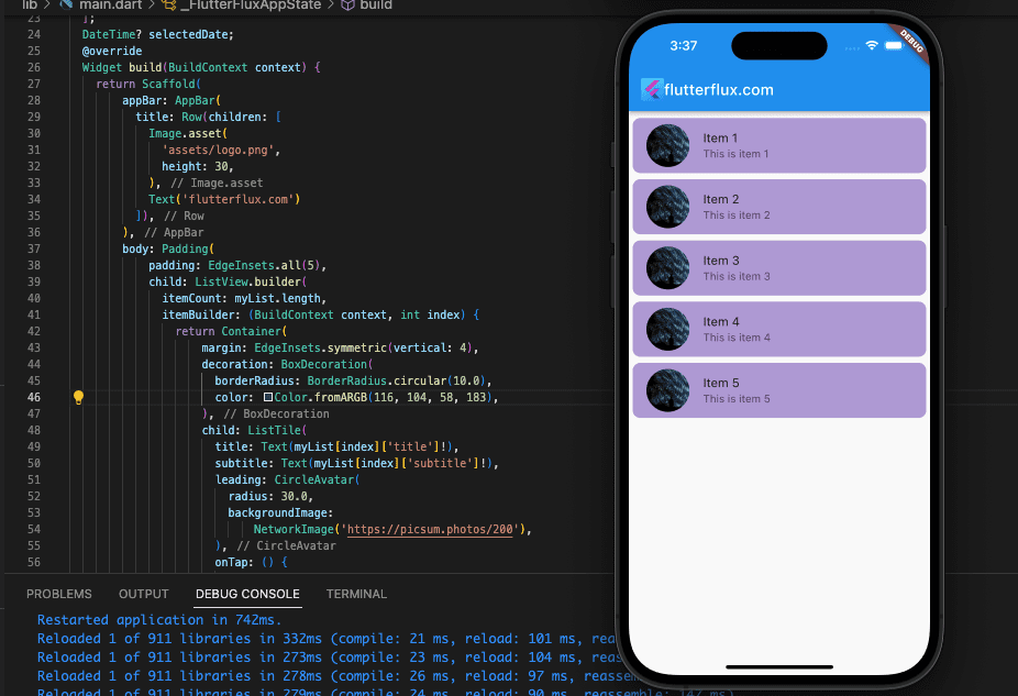
ListTile Border Radius Flutter
ListTile in Flutter can have a rounded border by enclosing it in a Container widget and then setting the border radius on the Container. Here is a sample:
import 'package:flutter/material.dart';

void main() {
  runApp(MaterialApp(
    home: FlutterFluxApp(),
  ));
}

class FlutterFluxApp extends StatefulWidget {
  const FlutterFluxApp({super.key});

  @override
  State createState() => _FlutterFluxAppState();
}

class _FlutterFluxAppState extends State {
  List<Map<String, String>> myList = [
    {"title": "Item 1", "subtitle": "This is item 1"},
    {"title": "Item 2", "subtitle": "This is item 2"},
    {"title": "Item 3", "subtitle": "This is item 3"},
    {"title": "Item 4", "subtitle": "This is item 4"},
    {"title": "Item 5", "subtitle": "This is item 5"},
  ];
  DateTime? selectedDate;
  @override
  Widget build(BuildContext context) {
    return Scaffold(
        appBar: AppBar(
          title: Row(children: [
            Image.asset(
              'assets/logo.png',
              height: 30,
            ),
            Text('flutterflux.com')
          ]),
        ),
        body: Padding(
            padding: EdgeInsets.all(5),
            child: ListView.builder(
              itemCount: myList.length,
              itemBuilder: (BuildContext context, int index) {
                return Container(
                    margin: EdgeInsets.symmetric(vertical: 4),
                    decoration: BoxDecoration(
                      borderRadius: BorderRadius.circular(10.0),
                      color: Color.fromARGB(116, 104, 58, 183),
                    ),
                    child: ListTile(
                      title: Text(myList[index]['title']!),
                      subtitle: Text(myList[index]['subtitle']!),
                      leading: CircleAvatar(
                        radius: 30.0,
                        backgroundImage:
                            NetworkImage('https://picsum.photos/200'),
                      ),
                      onTap: () {
                        // Do something when the user taps the ListTile
                      },
                    ));
              },
            )));
  }
}
Here, we’ve enclosed the ListTile within a Container and given it a boundary radius of 10.0 and margin 4. We’ve also made Color.fromARGB(116, 104, 58, 183) the default for the Container background color. You can change the border shape by adjusting the radius value.
Conclusion
For custom listview in your app, ListTile in Flutter widget is powerful and flexible. It displays text, graphics, and icons clearly and concisely. You can add a leading or trailing icon, subtitle text, and custom backgrounds by changing its attributes. The ListTile widget also supports tap events and selection states, making interactive and responsive list views easy to design.

